Redesigning for Reputation. Redreaming Paint Company commissioned a full logo and color palette redesign as they started expanding into larger markets and high-end custom homes. The original identity, while familiar, felt more “small-town” than strategic—lacking the polish needed to build trust with general contractors and commercial clients.
The goal: create a visual system that feels elevated, credible, and aligned with the company’s growing reputation for craftsmanship and professionalism.
001
Primary Logo Variations
Designed for Recognition, Rooted in Meaning
At the heart of the redesign is a lowercase “r”—the most prominent visual element anchoring the “Redreaming” name. Its clean, geometric form ensures instant recognition and brand clarity, especially in digital and print applications.
The “r” is constructed from three square swatches—a deliberate nod to paint chips, the starting point of every paint project. While many competitors lean on paint rollers as visual shorthand, this mark sets Redreaming apart by referencing the moment of inspiration: choosing color. It’s a subtle but strategic shift that differentiates the brand while staying true to its craft.
Each swatch also carries deeper meaning. They represent the founder’s three sons and the Trinity—reflecting his strong faith and grounding the brand in personal and spiritual resonance. The upward arrow shape formed by the swatches evokes aspiration, remembrance, and belief. It also subtly echoes the silhouette of a cancer awareness ribbon—a quiet tribute to the founder’s journey as a cancer survivor and a symbol of resilience woven into the brand’s DNA.
These layered details add emotional depth without compromising simplicity, creating a logo that’s both visually refined and personally resonant.
002
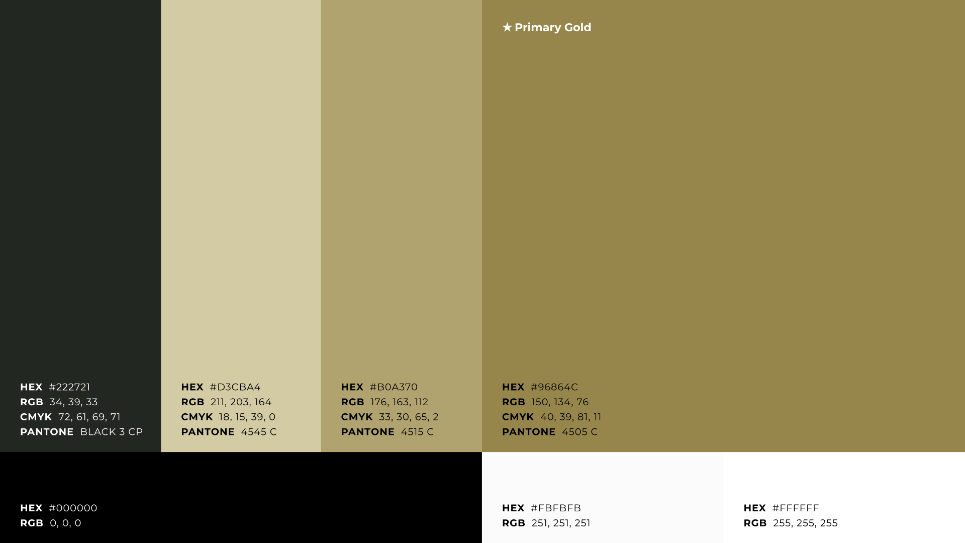
Color Pallet
Premium Tones That Build Trust
The refined palette of layered golds and softened black marks a deliberate departure from Redreaming’s original yellow-and-black scheme—but not a rejection. It’s a thoughtful elevation of familiar tones, reimagined to reflect the brand’s growth and maturity.
Golds were chosen for their association with quality, longevity, and elevated service—values that resonate with discerning homeowners and commercial clients alike. The softened black adds depth and professionalism, reinforcing a sense of stability and reliability.
Together, these tones speak to the kind of trustworthiness and polish that general contractors and commercial partners expect when selecting vendors for high-value projects. The palette signals that Redreaming isn’t just a residential painter—it’s a brand equipped to handle large-scale, high-end work with precision and professionalism.
This visual shift honors the company’s origins while positioning it for broader markets and premium clientele. It’s familiar, but refined—rooted in the past, ready for the future.
003
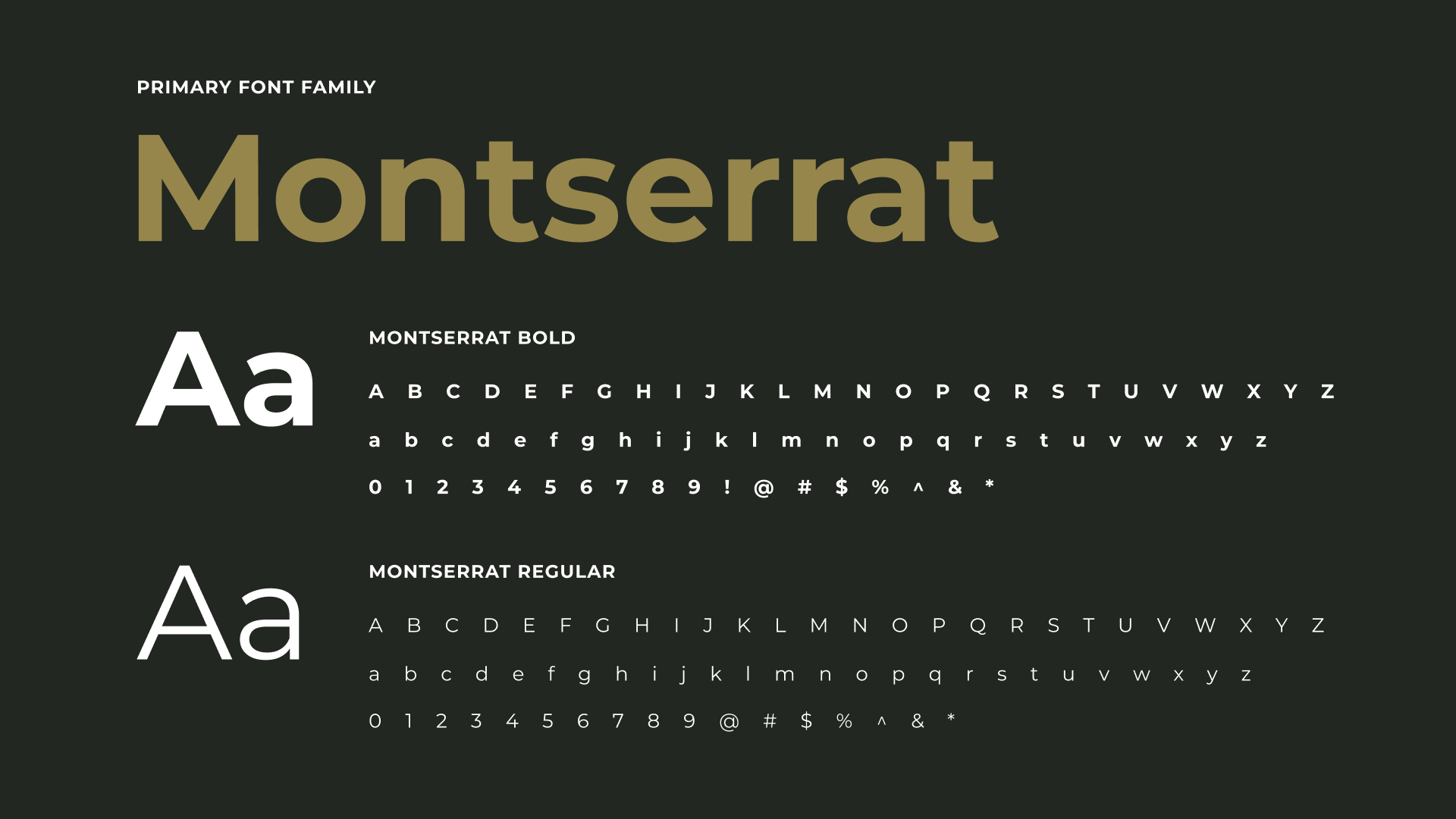
Font Family
Montserrat: A Typeface That Reflects Craftsmanship and Clarity
Montserrat was chosen as Redreaming Paint Company’s primary typeface for its clean geometry, modern tone, and exceptional legibility. Its approachable yet refined character mirrors the brand’s evolution—balancing warmth with professionalism, and accessibility with premium positioning.
Its wide availability ensures consistent branding across all touchpoints—from job site signage to digital proposals—without introducing licensing barriers that could limit future use. This makes it a practical and sustainable choice for a growing business investing in long-term brand equity.
Inspired by the signage of Buenos Aires’ Montserrat neighborhood, the typeface blends heritage with modernity. Its generous x-height and open letterforms support clarity and trust—qualities that align with Redreaming’s commitment to craftsmanship, personal connection, and elevated service.