Washington State Fair & Events Center
A modern, mobile‑first digital experience that clarified event discovery, strengthened the brand, and delivered major year‑over‑year engagement growth.
Task
-
Custom DatoCMS Website Theme
Role
-
UI Design
Agency
Before
After
One Year After Launch – Impact Overview
150% increase in active users
150% increase in event interactions
95% increase in page views
Faster task completion with stable interaction depth
Brand Background
The Washington State Fair Event Center is the largest event venue in Washington State and home to five signature experiences that celebrate community, culture, and seasonal traditions.
Its flagship event — the 20-day Washington State Fair — is one of the largest fairs in the country, drawing hundreds of thousands each September. The Spring Fair kicks off each April with eight days of family-friendly fun, while The Taste Northwest brings a culinary celebration to life in June. Oktoberfest Northwest delivers the state’s largest Munich-style gathering in October, and Holiday Magic wraps up the year with a festive winter wonderland in December.
Beyond its marquee events, the Event Center hosts over 125 additional gatherings annually — from car shows and corporate picnics to private celebrations and competitive sports tournaments — making it a year-round destination for entertainment and connection.
Problems To Address
-
Confusing Navigation
-
Outdated Visual Identity
-
Poor Mobile Usability
-
Fragmented Tools Split between Website + App
-
Inconsistent & Limited Editorial Patterns
-
Signature Events Were Buried
Project Overview & Goals
The Washington State Fair Event Center engaged us to modernize their digital presence and reimagine how visitors interact with their brand online. The existing website was visually dated, structurally rigid, and lacked the flexibility needed to support their evolving identity as a year-round event destination — not just “the fair.” Our goals were multifaceted:
Modernize the digital experience with a fresh, vibrant design system that reflects the energy and diversity of their events
Improve mobile usability to better serve on-the-go visitors and reduce reliance on their outdated standalone mobile app
Increase ticket sales and event engagement through clearer navigation, stronger calls to action, and more dynamic content presentation
Support a broader brand shift from “just the fair” to a full-service event center with seasonal experiences and community programming
Technical Constraints & Design Strategy
The site was built on DatoCMS, a headless CMS that housed all event and location data. While the client wanted to retain this system, it came with unique challenges:
No predefined page templates meant we had to design modular, reusable components — “molecules” — that could be arranged in any order and still maintain visual and functional cohesion
We provided layout guidance and best practices to help the internal team build pages that felt intentional, even within a flexible CMS structure
The backend editing experience was disjointed, making it difficult for staff to update content confidently. Our design system aimed to bridge that gap by aligning frontend patterns with backend logic
My Role & Responsibilities
Led UI design for the WSFEC’s new digital experience, from early discovery through final handoff.
Presented design solutions to WSFEC’s leadership throughout the project, guiding decision‑making with clear rationale, prototypes, and iterative refinements.
Refined down the WSFEC’s bloated brand color palette into a cohesive, manageable system that could scale across digital and physical touchpoints.
Designed a modular, component‑driven system that empowered editors to build custom pages while still following recommended layout patterns and best practices.
Aligned design patterns with DatoCMS constraints, improving editorial workflows and reducing friction for non‑designers managing year‑round content.
Defined the visual direction and brand evolution, transitioning WSFEC from muted, legacy tones to a bold, expressive palette that better reflects their energy.
Collaborated closely with engineers, writers, and project managers to ensure the system was practical, accessible, and technically feasible.
Visual Direction & Brand Evolution
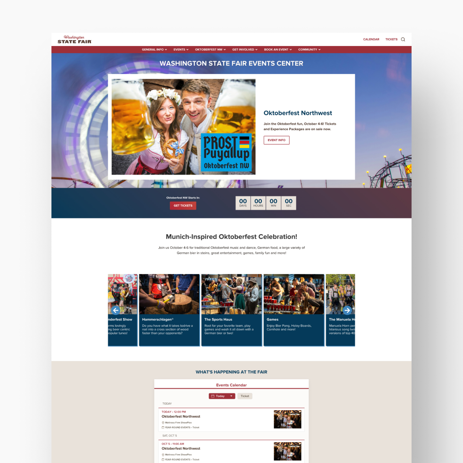
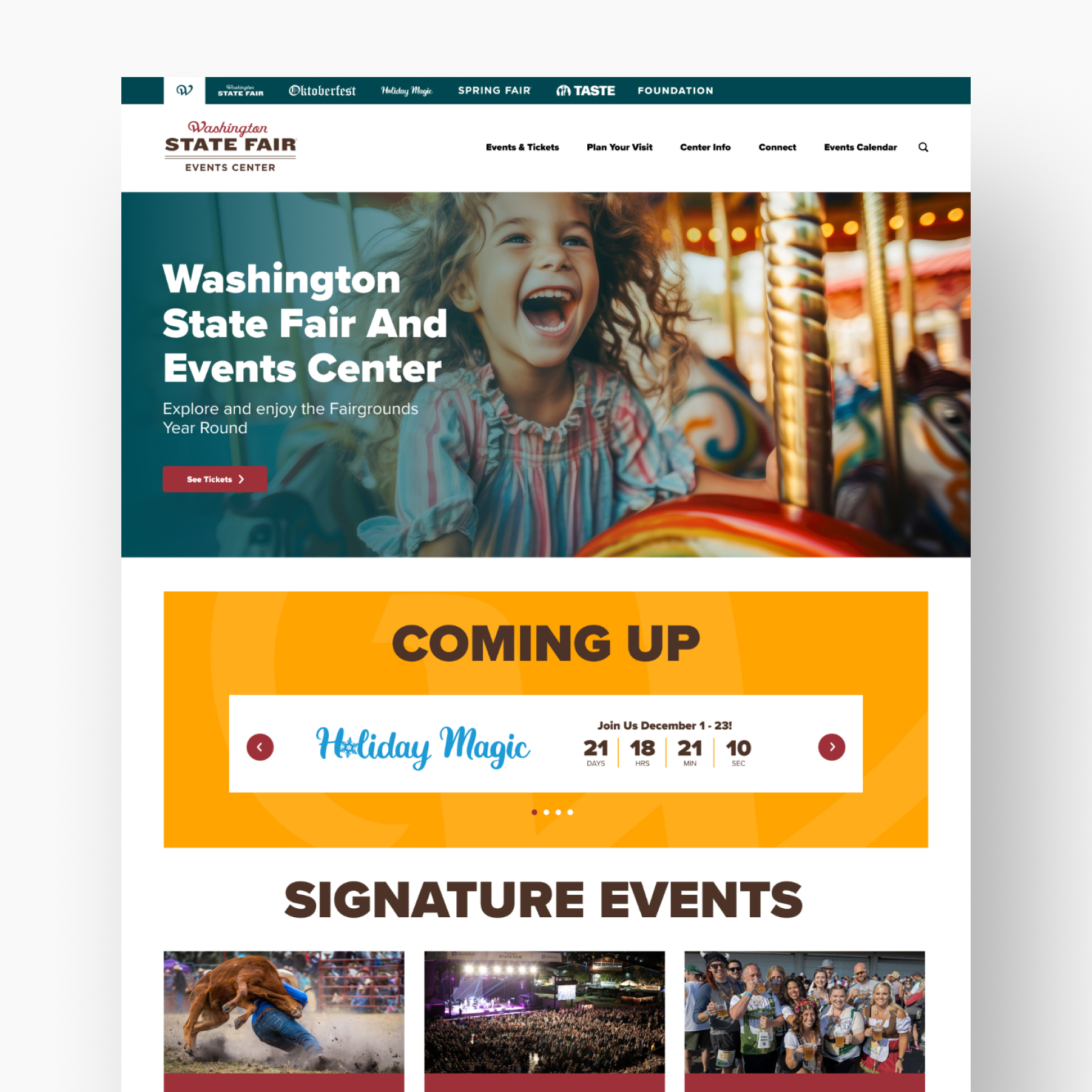
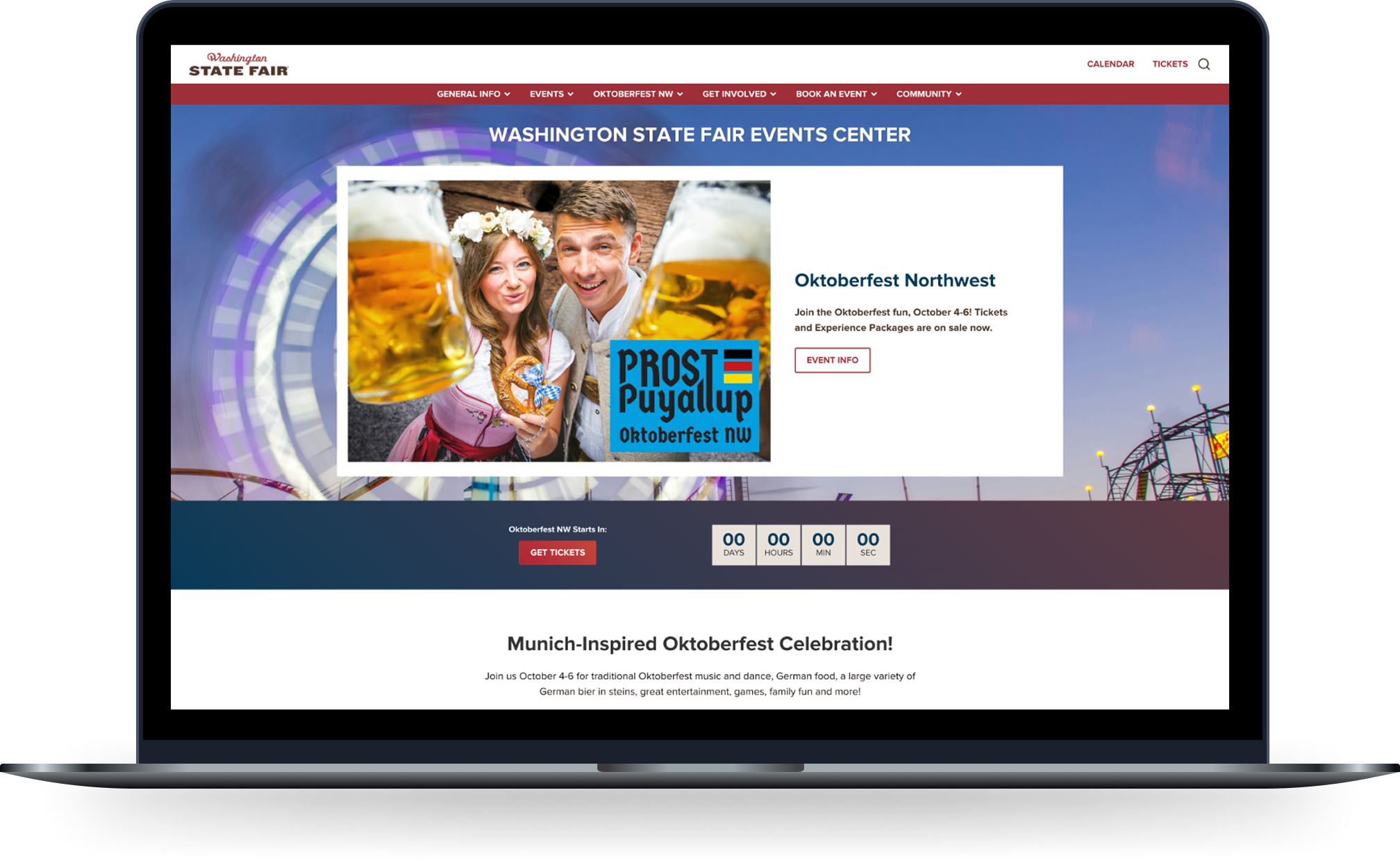
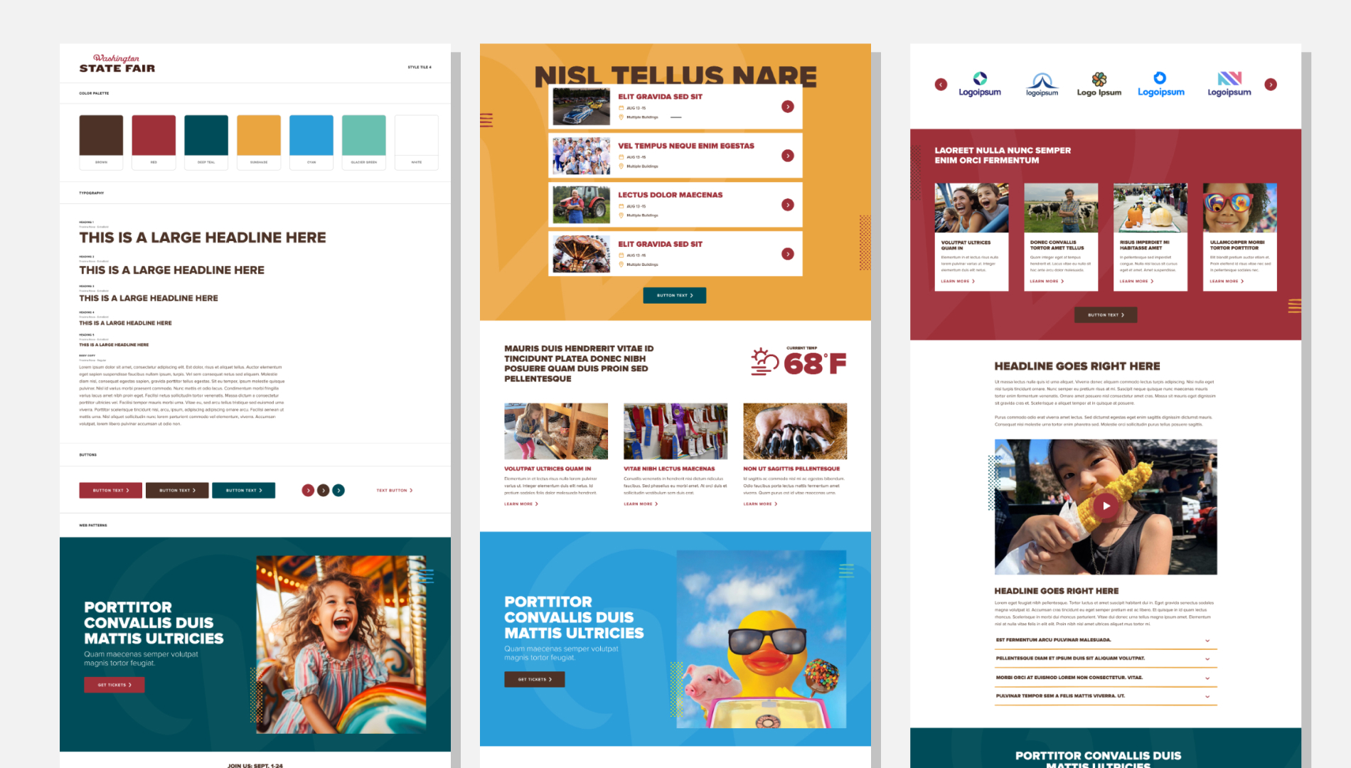
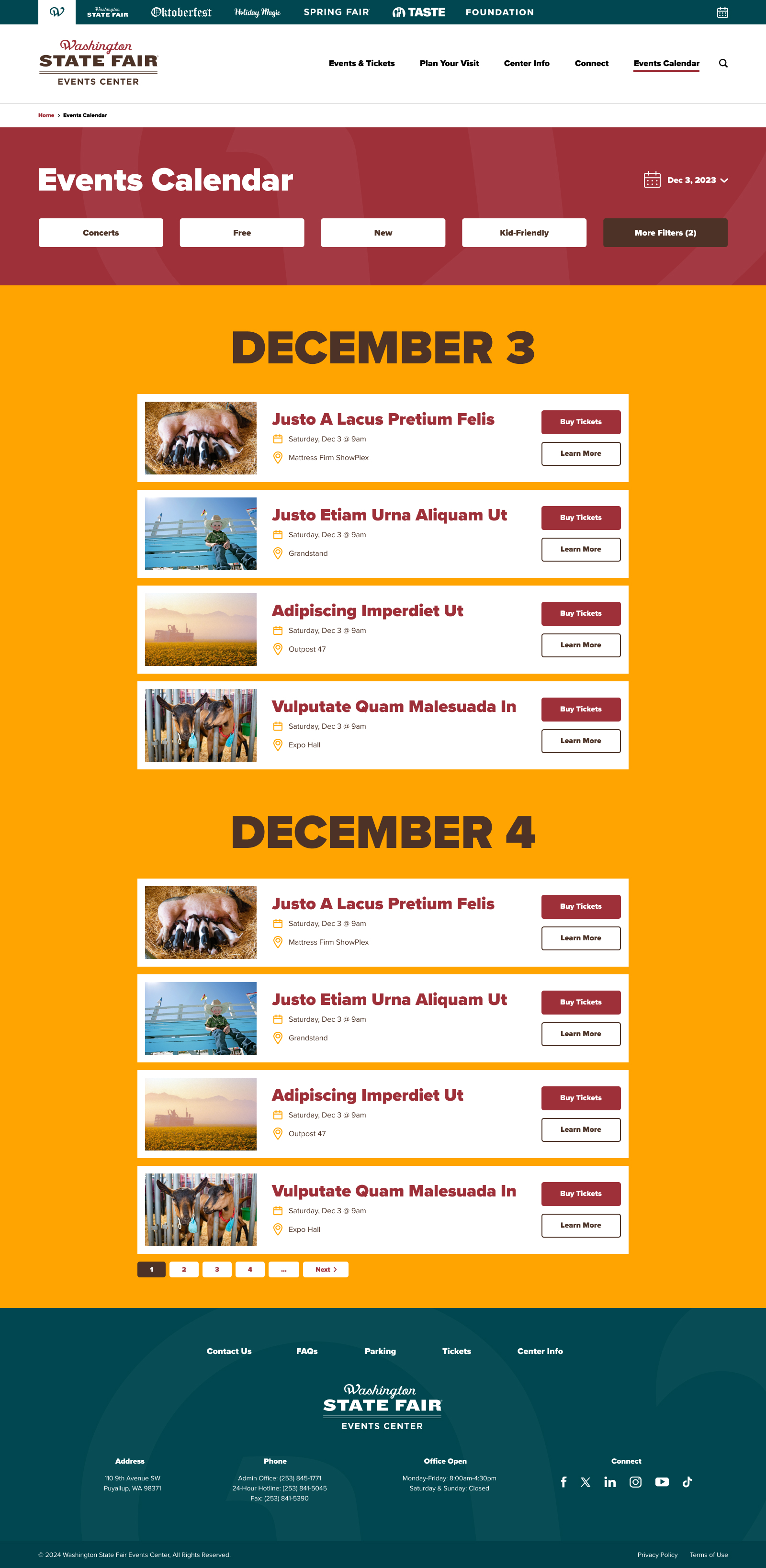
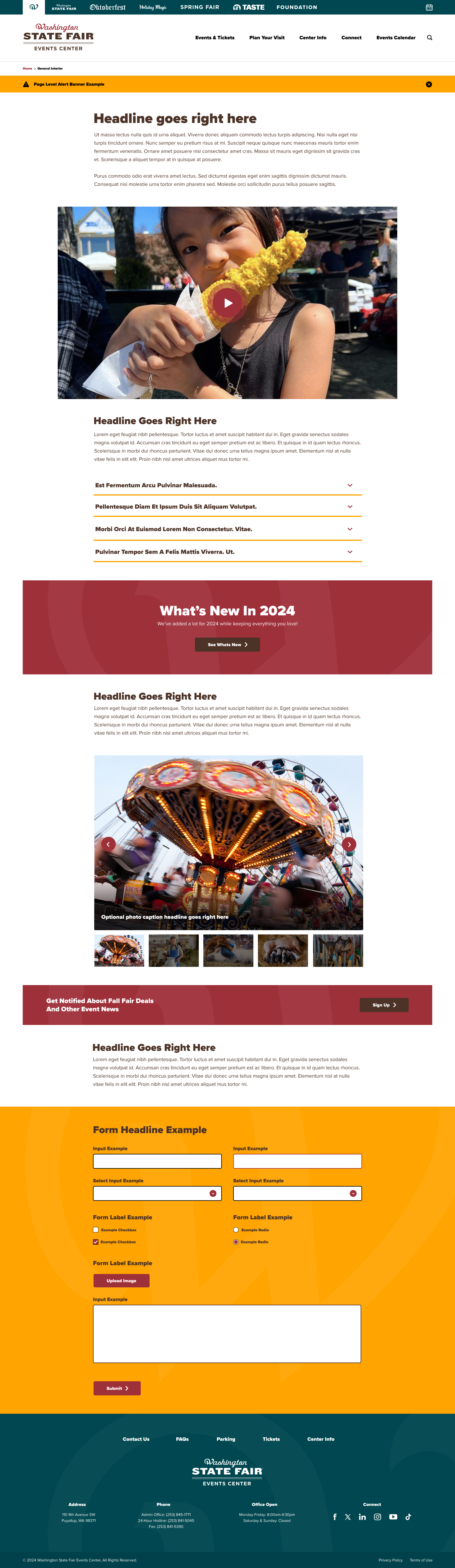
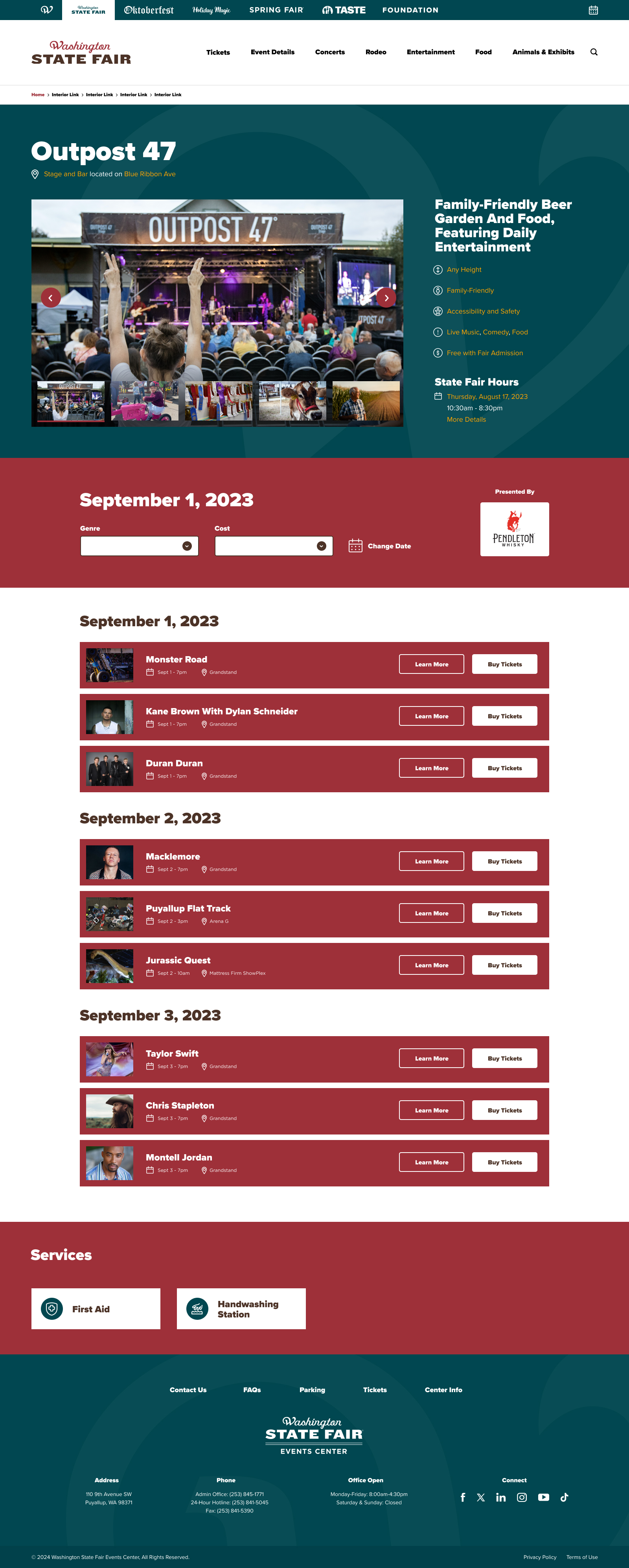
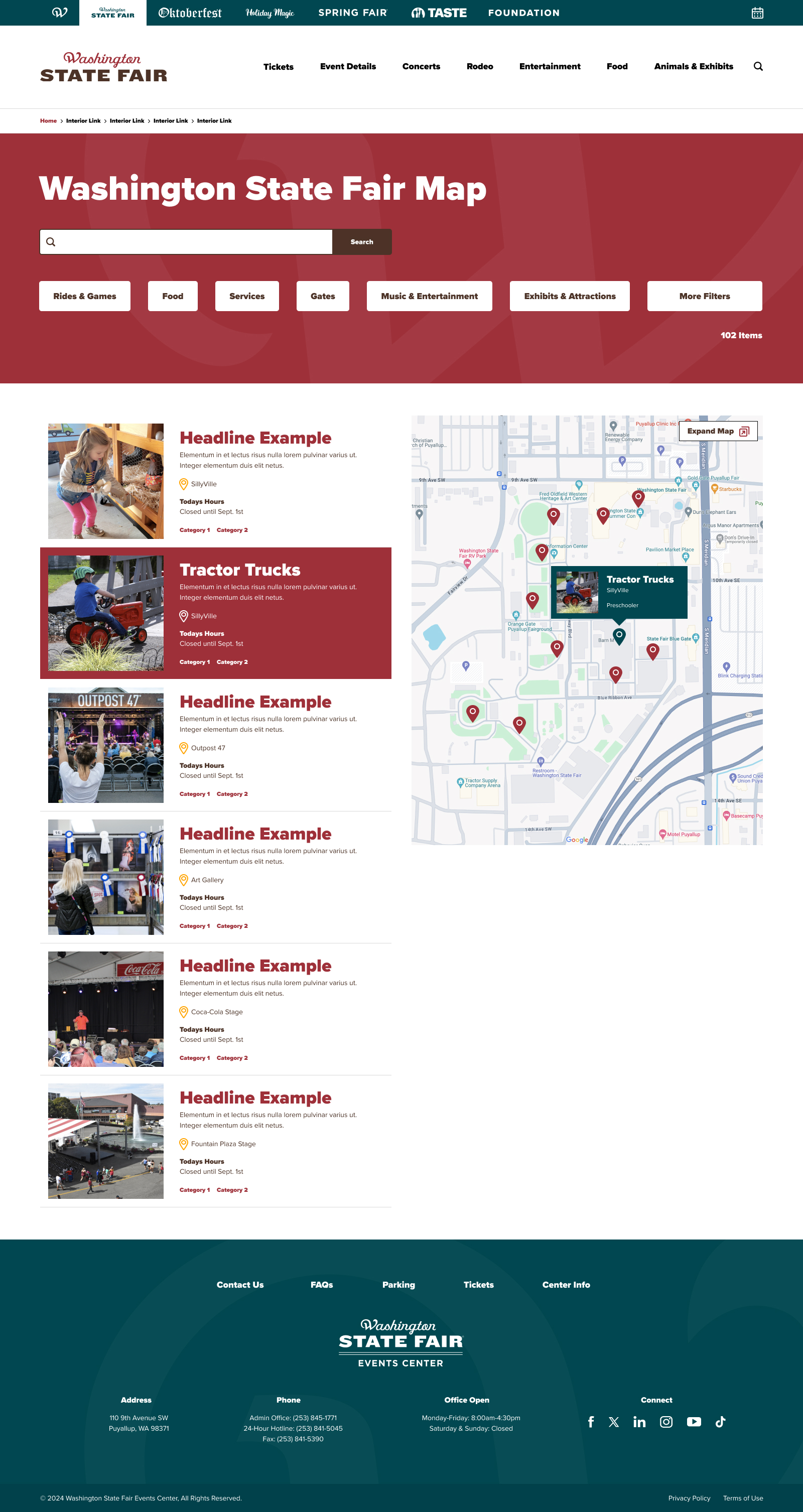
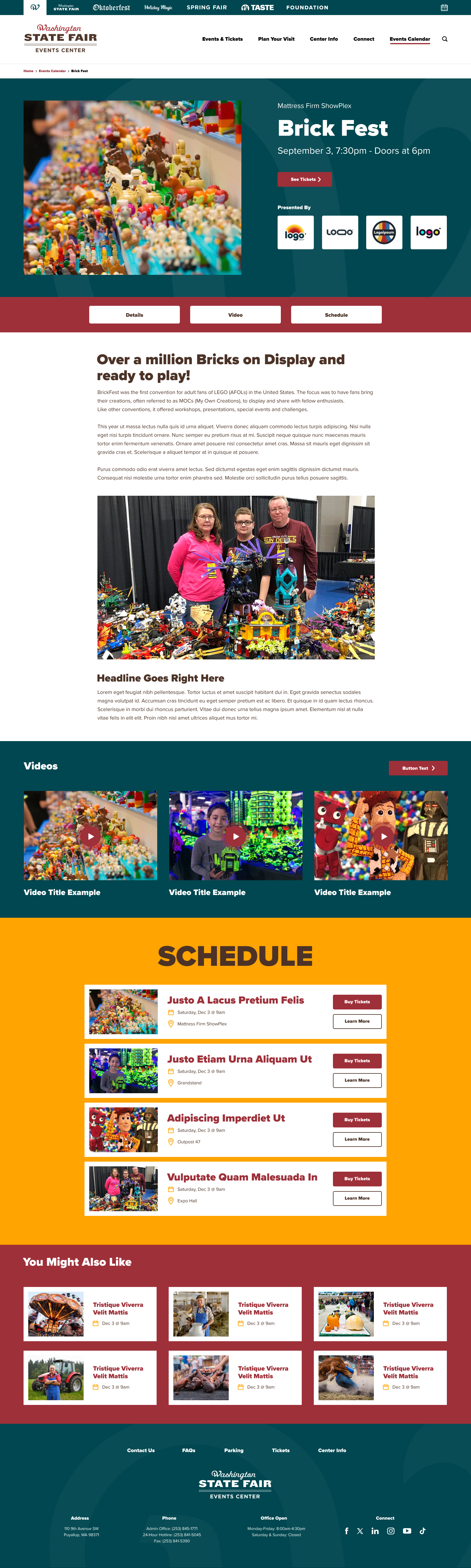
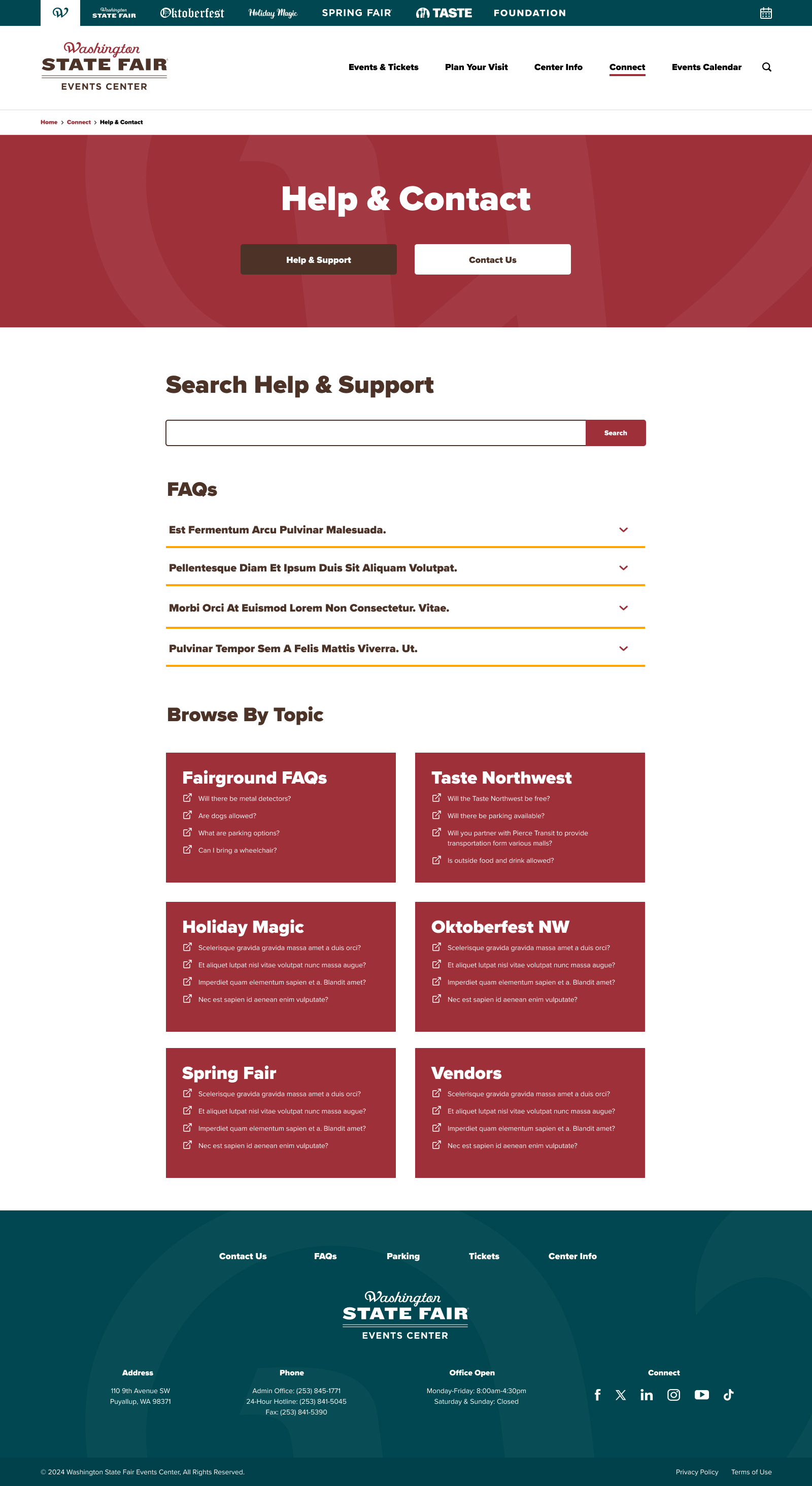
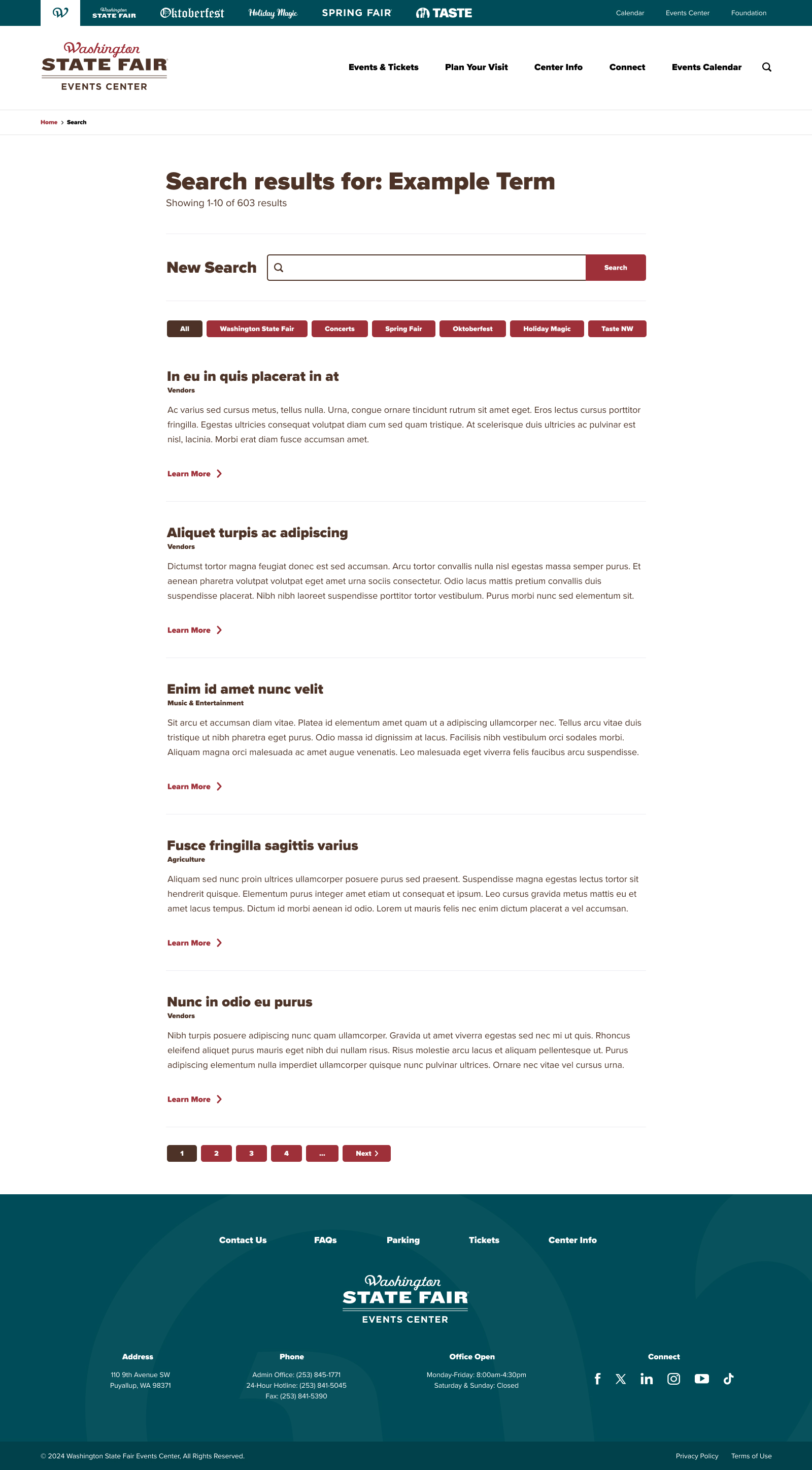
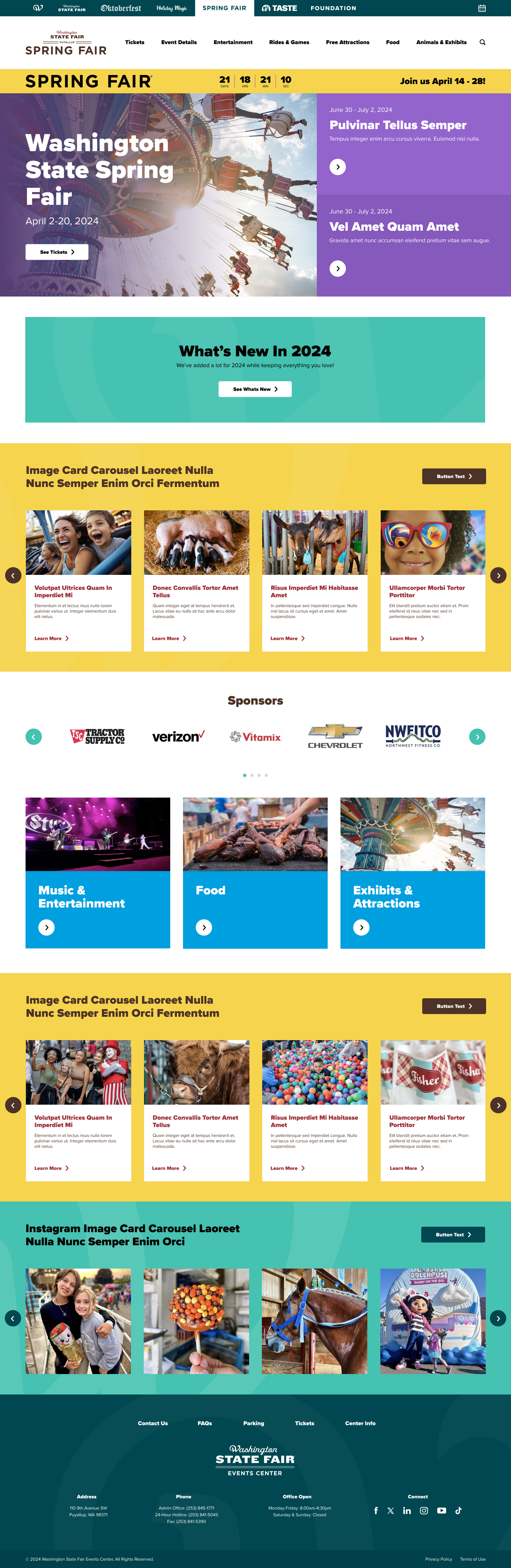
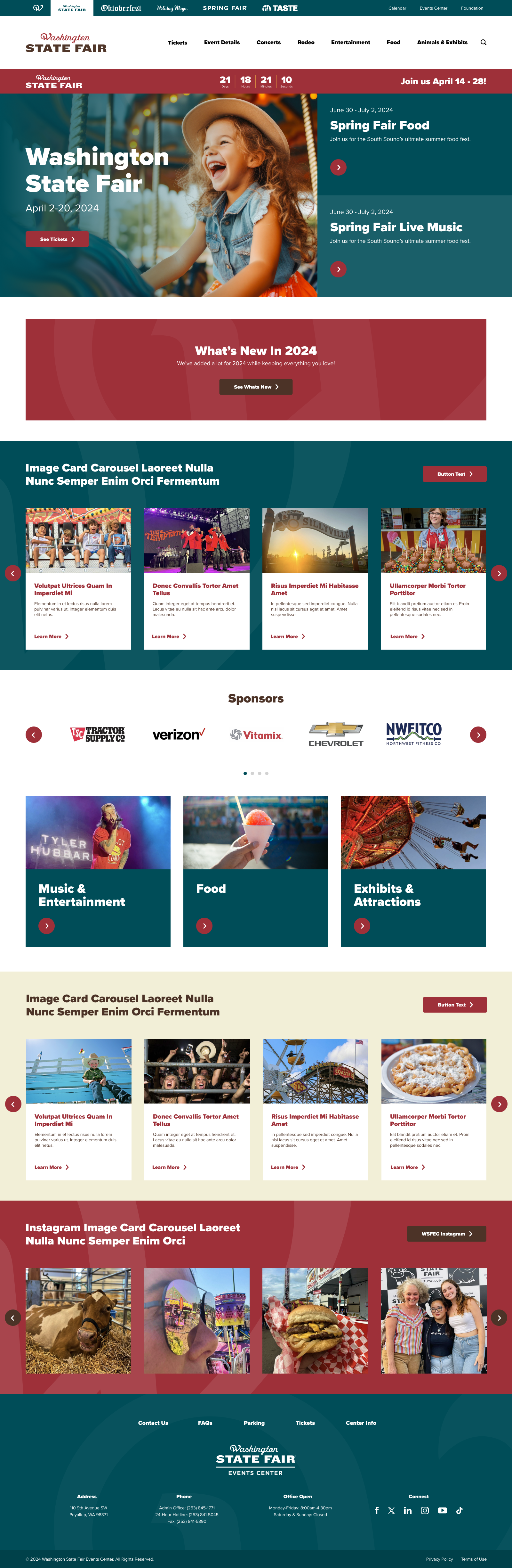
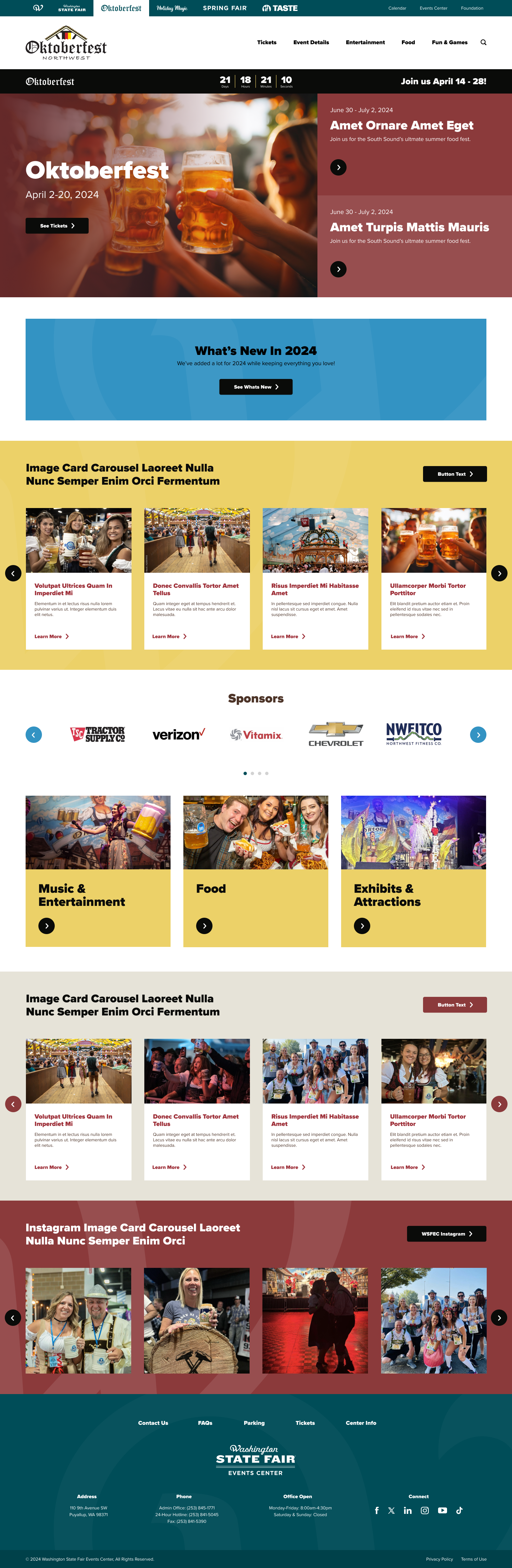
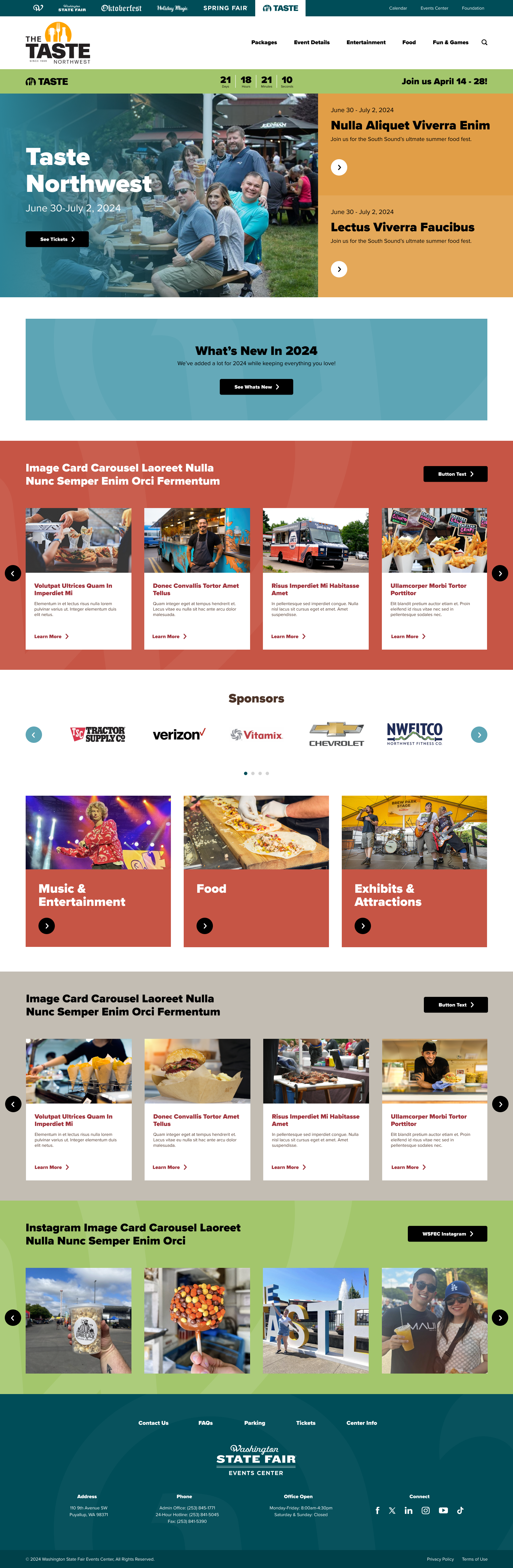
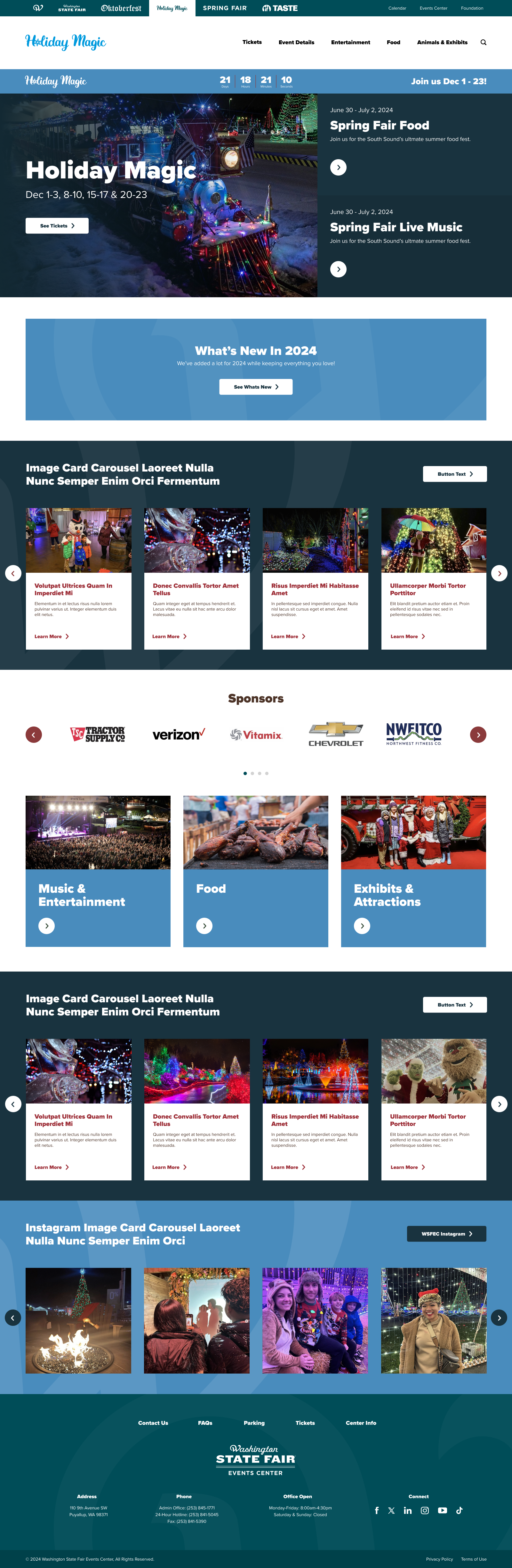
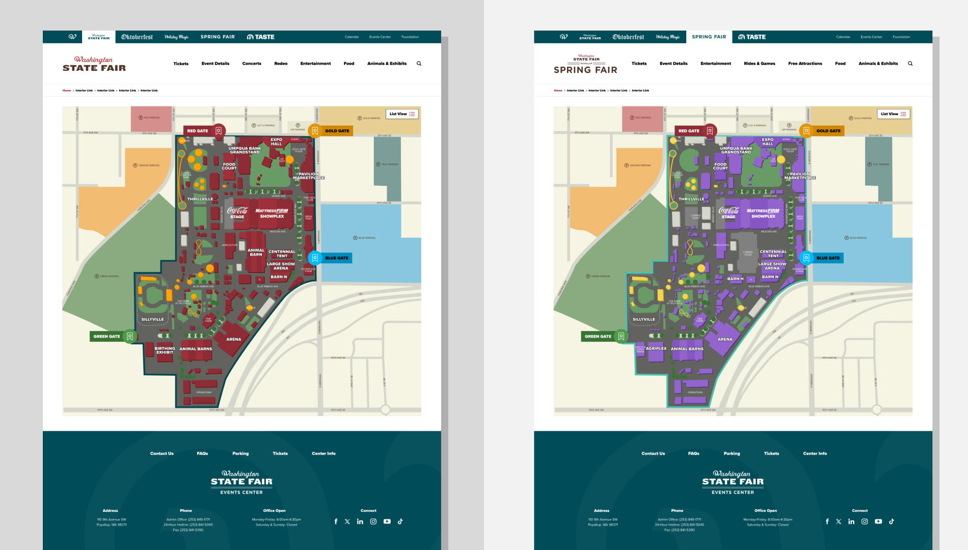
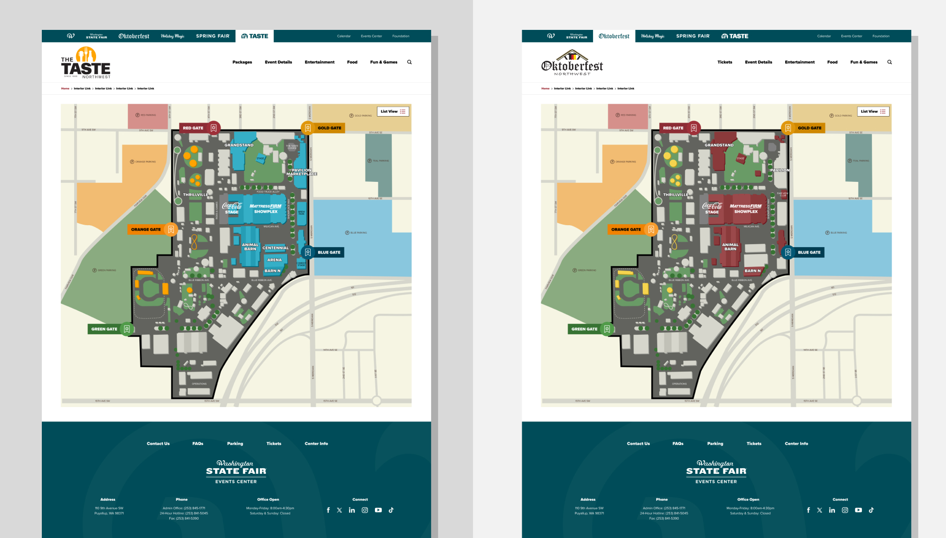
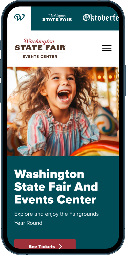
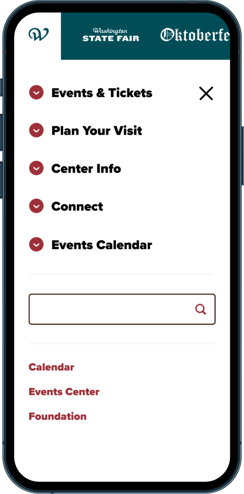
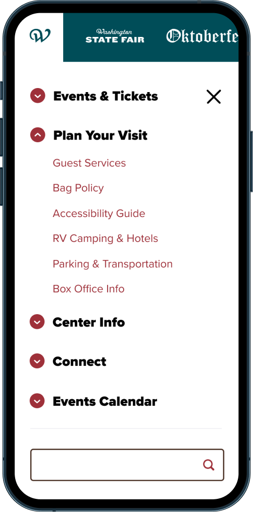
The existing brand leaned heavily on browns and reds — colors that felt muted and dated. With a newly developed, more expressive palette in hand, the team was ready to explore a refreshed visual identity that felt modern, welcoming, and aligned with the energy of their seasonal events.
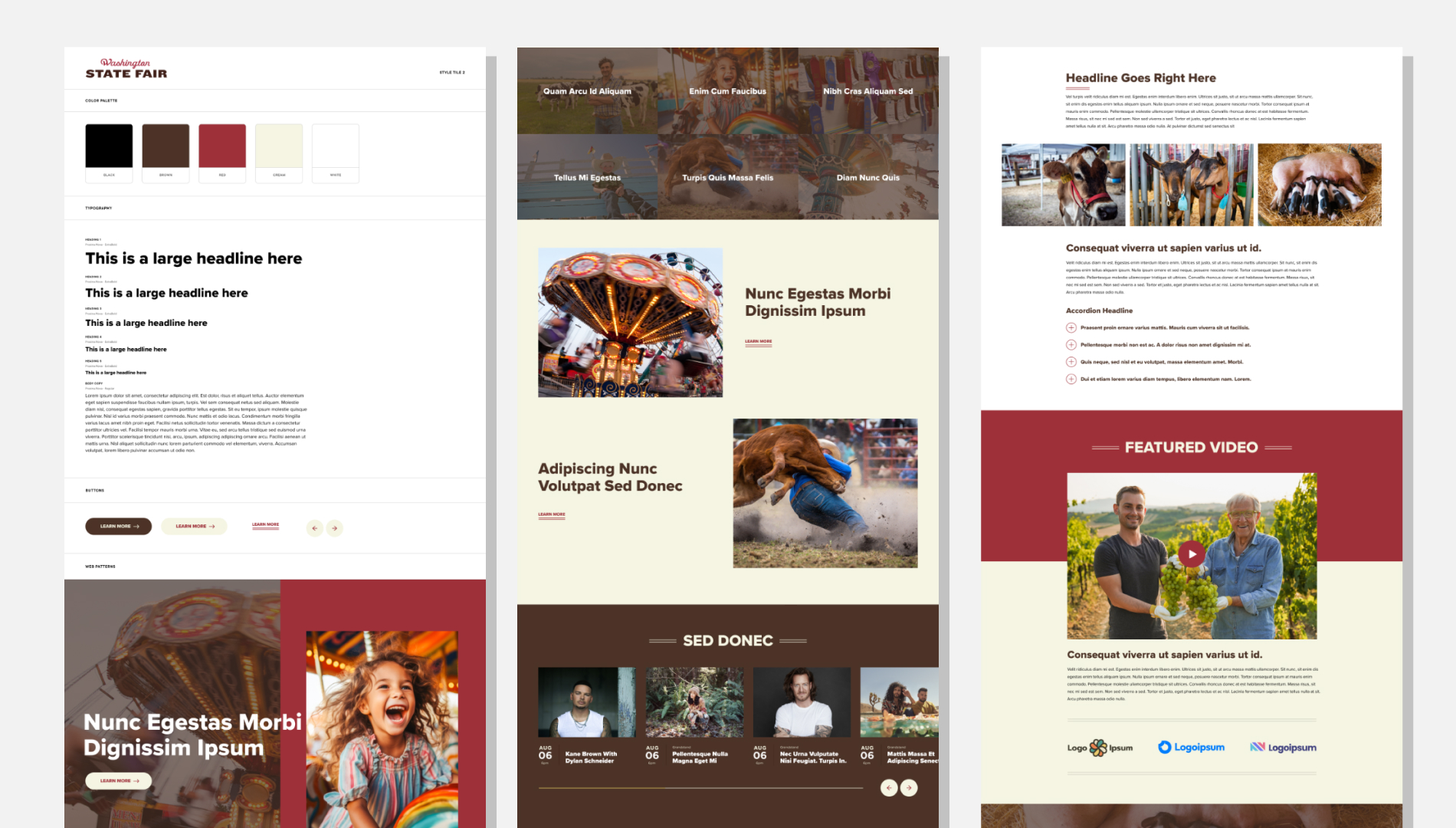
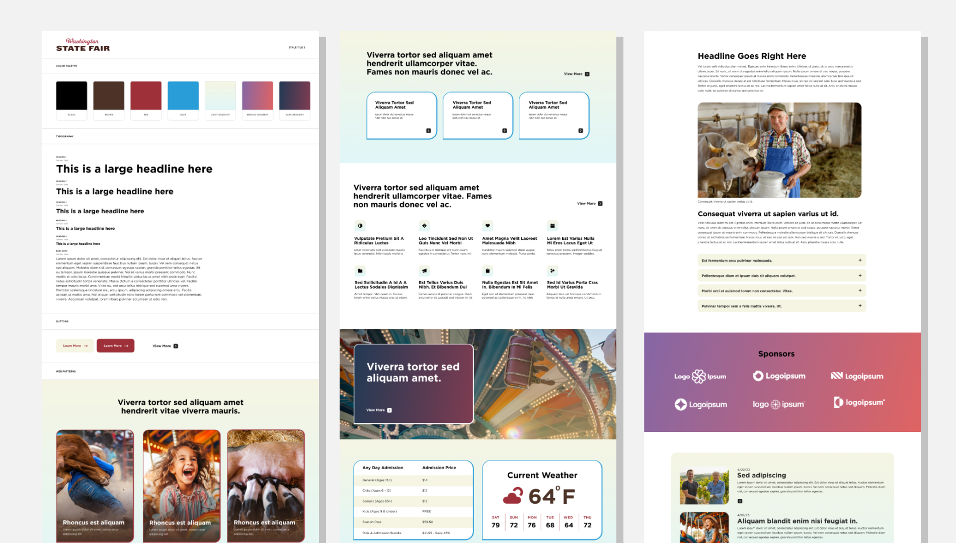
To guide that evolution, I created three distinct visual directions, each exploring a different balance of color energy, personality, and clarity. These style‑tile explorations helped stakeholders understand how far the brand could stretch and where the most effective middle ground lived.
Direction 1 — Modern Northwest A grounded, structured direction that introduced subtle vibrancy while preserving familiarity.
Direction 2 — Expressive Seasonal Energy A brighter, more dynamic approach that used high‑contrast color pairings to reflect the personality of each event.
Direction 3 — Bold Festival Identity A high‑energy, high‑contrast direction that pushed the brand into a more playful, festival‑driven space.
Across all three directions, the design principles remained consistent:
Introducing vibrant, high‑contrast color pairings that captured the spirit of each seasonal event
Designing playful, accessible UI patterns that balanced energy with clarity
Elevating the overall aesthetic to feel welcoming, modern, and distinctly Northwest
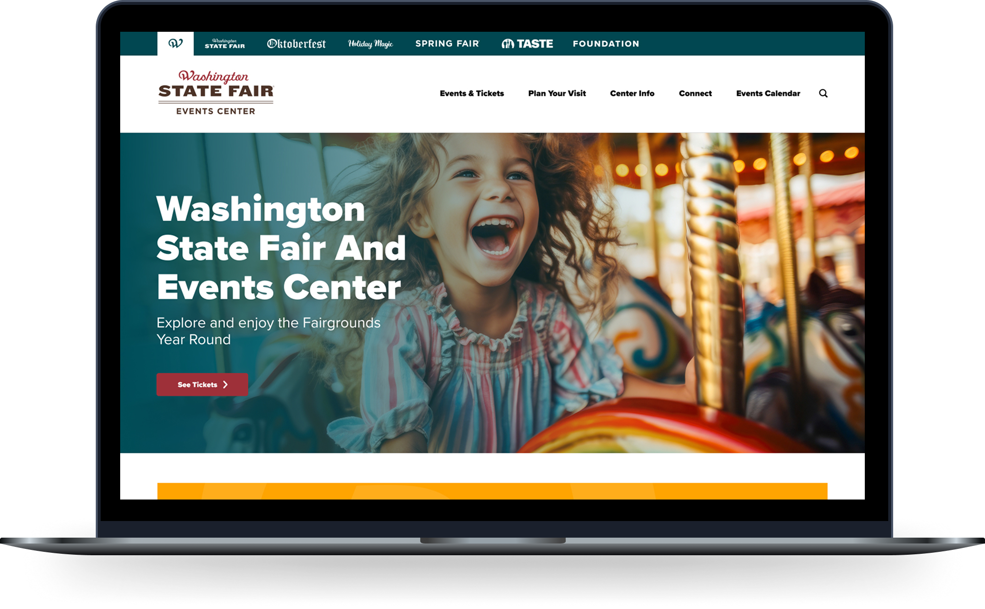
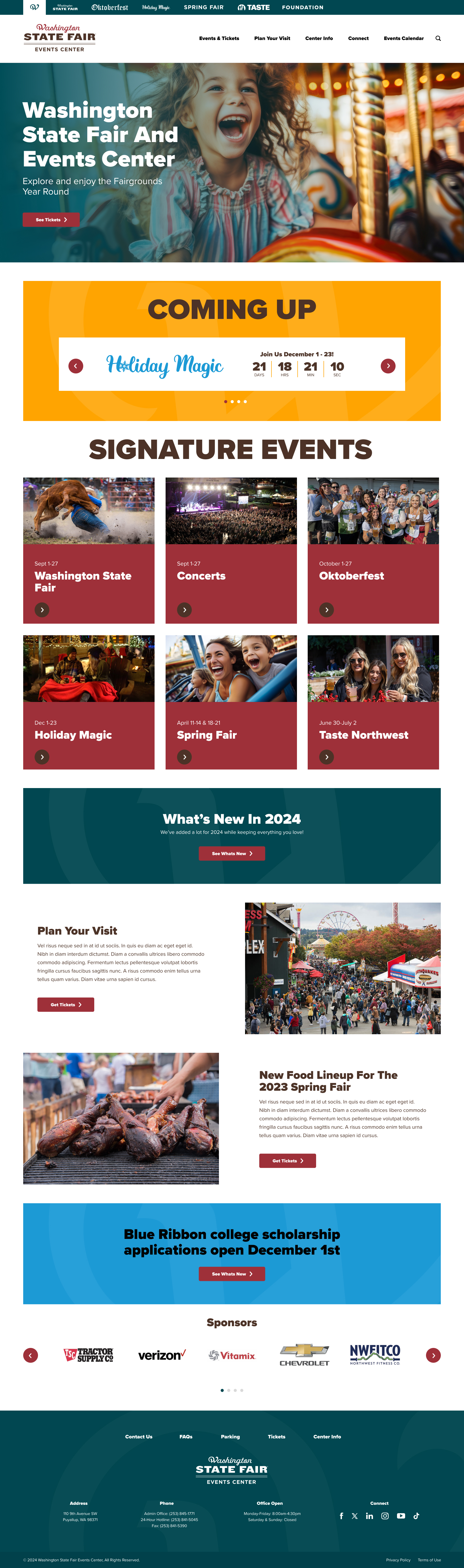
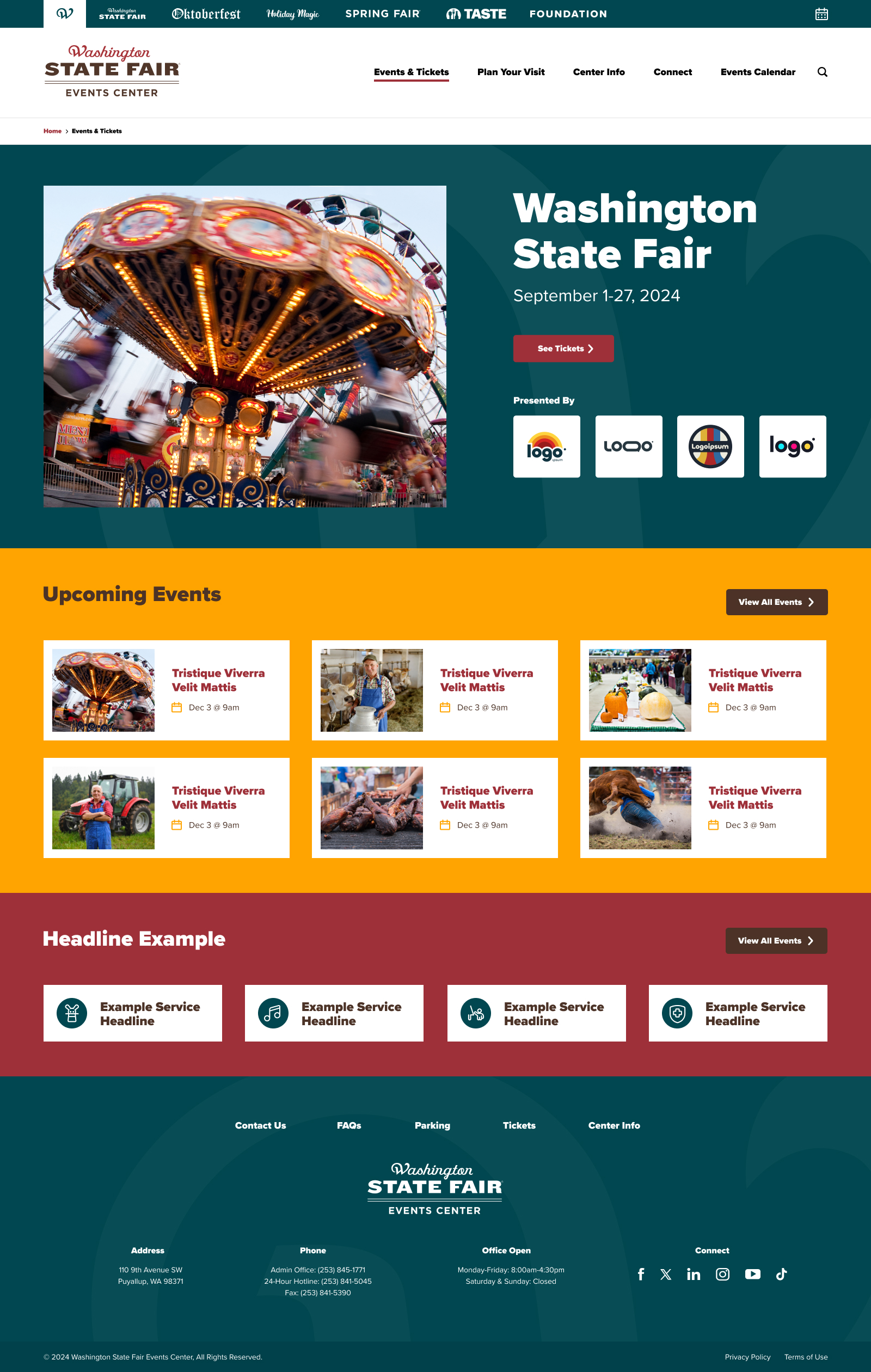
These explorations aligned the team around a direction that balanced expressive personality with usability — ultimately informing the final visual system used across the redesigned experience.
Design Principles
-
Make It Mobile-First
-
Guide Editors, Don't Restrict Them
-
Bring The Brands Energy Forward
-
Reduce Cognitive Load For Visitors
Experience Design & Visitor Tools
Beyond improving usability, the redesign strengthened the fair’s brand presence across every touchpoint. Key enhancements included:
- Mobile‑first layouts and contextual tools that simplified on‑site navigation
- Interactive event filters, schedules, and map components
- A custom map system built on Google Maps, styled to match each signature event’s visual identity — creating a cohesive, branded experience from digital planning to on‑site exploration
- Consolidation of all visitor tools into the website, enabling the retirement of the legacy mobile app
Final Outcomes
What I Delivered
Full UI design for the redesigned digital experience
Modular component system for 125+ annual events
Visual direction and brand evolution
Editorial workflow alignment for DatoCMS
Mobile‑first layouts and visitor tools
Prototypes and design rationale for leadership
A Redesign That Transformed Performance
One year after launch, the redesigned WSFEC website delivered a 150% increase in active users, a 150% increase in event interactions, and a 95% increase in page views. Engagement time decreased while interaction depth remained stable, showing that users were able to complete tasks more efficiently without sacrificing engagement quality.
Reflection
This project reinforced the value of designing systems that empower non‑designers. If extended, I’d explore deeper personalization for frequent visitors and more dynamic, event‑driven modules to support year‑round engagement.