


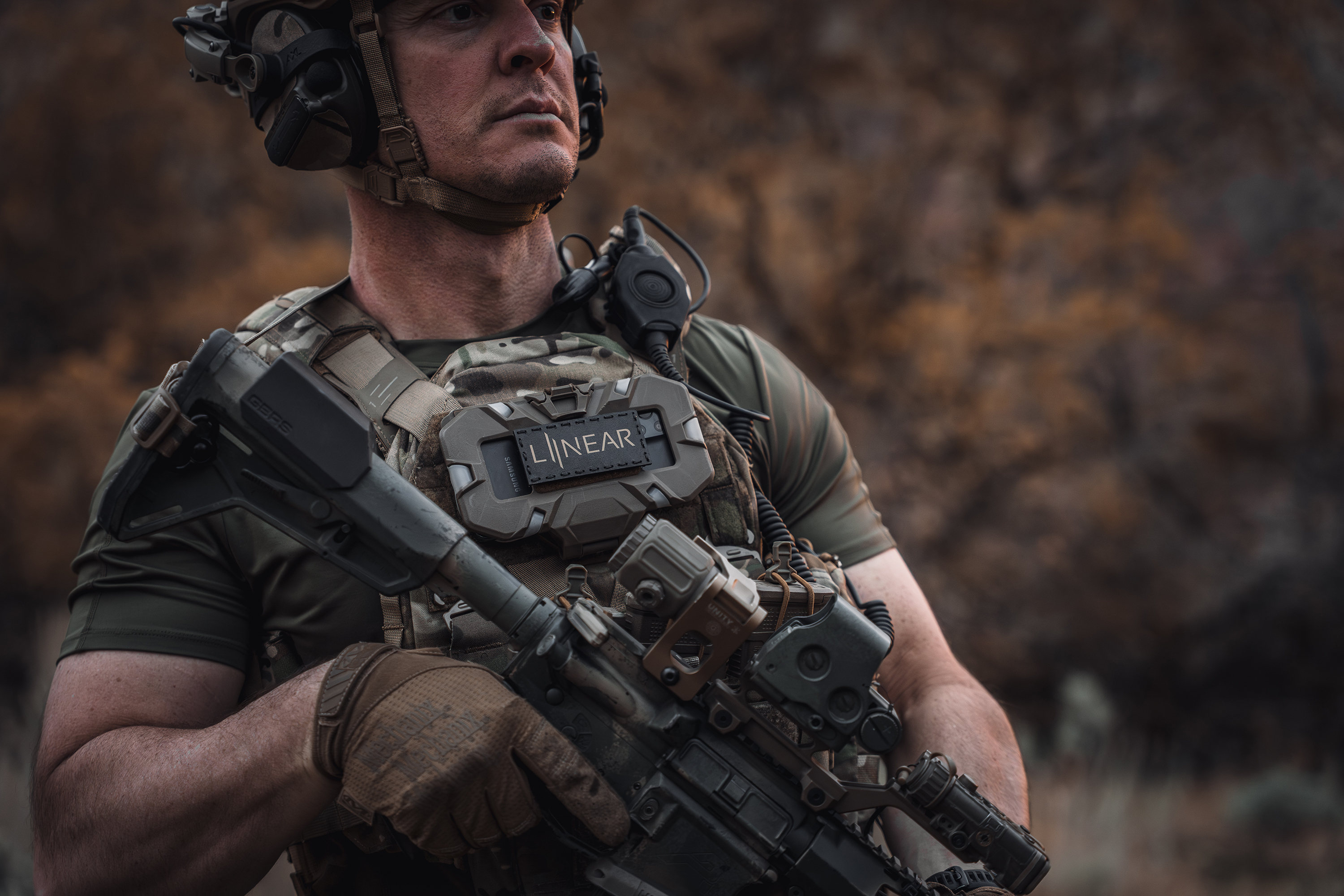
LINEAR Clothing


001
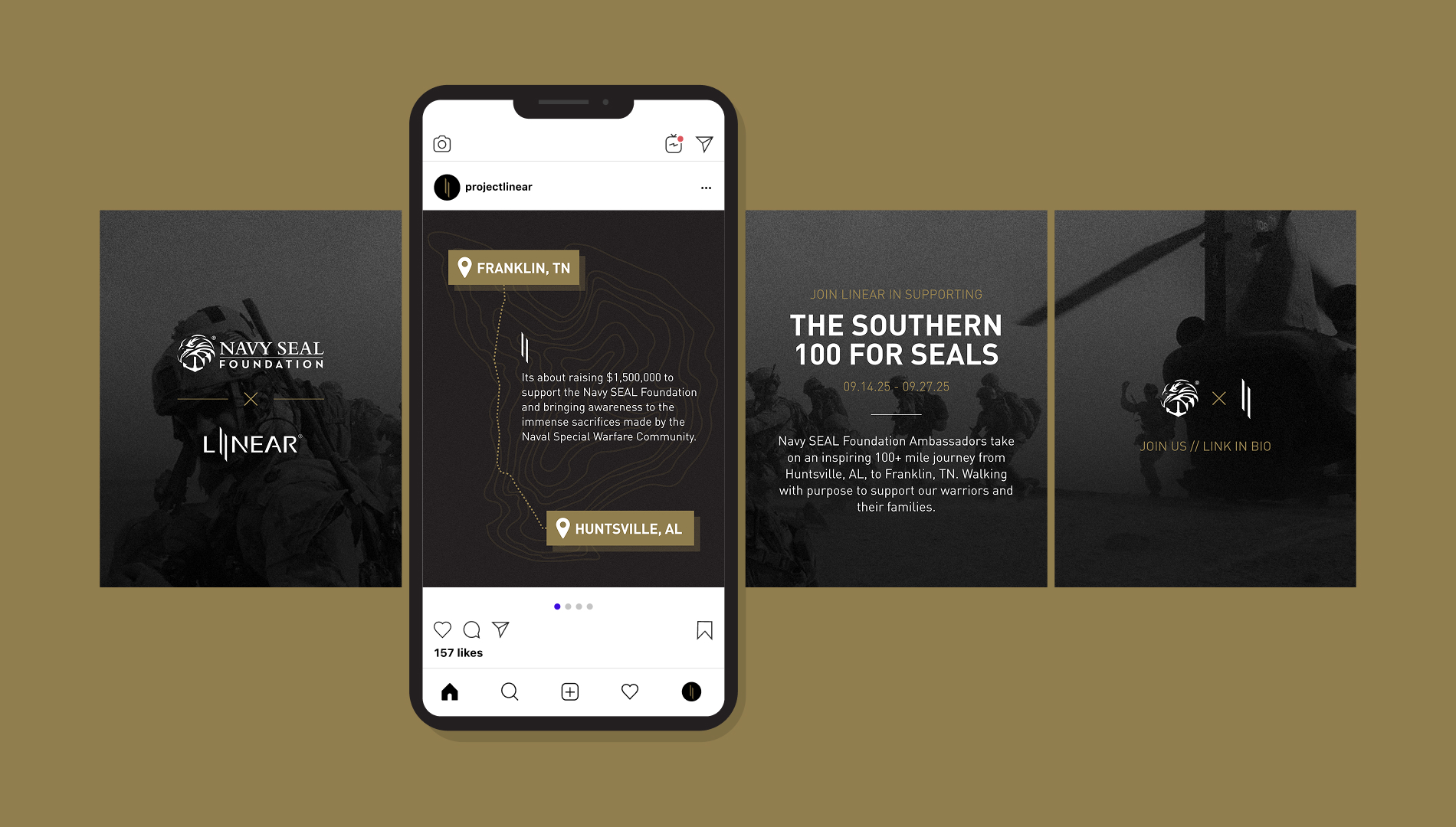
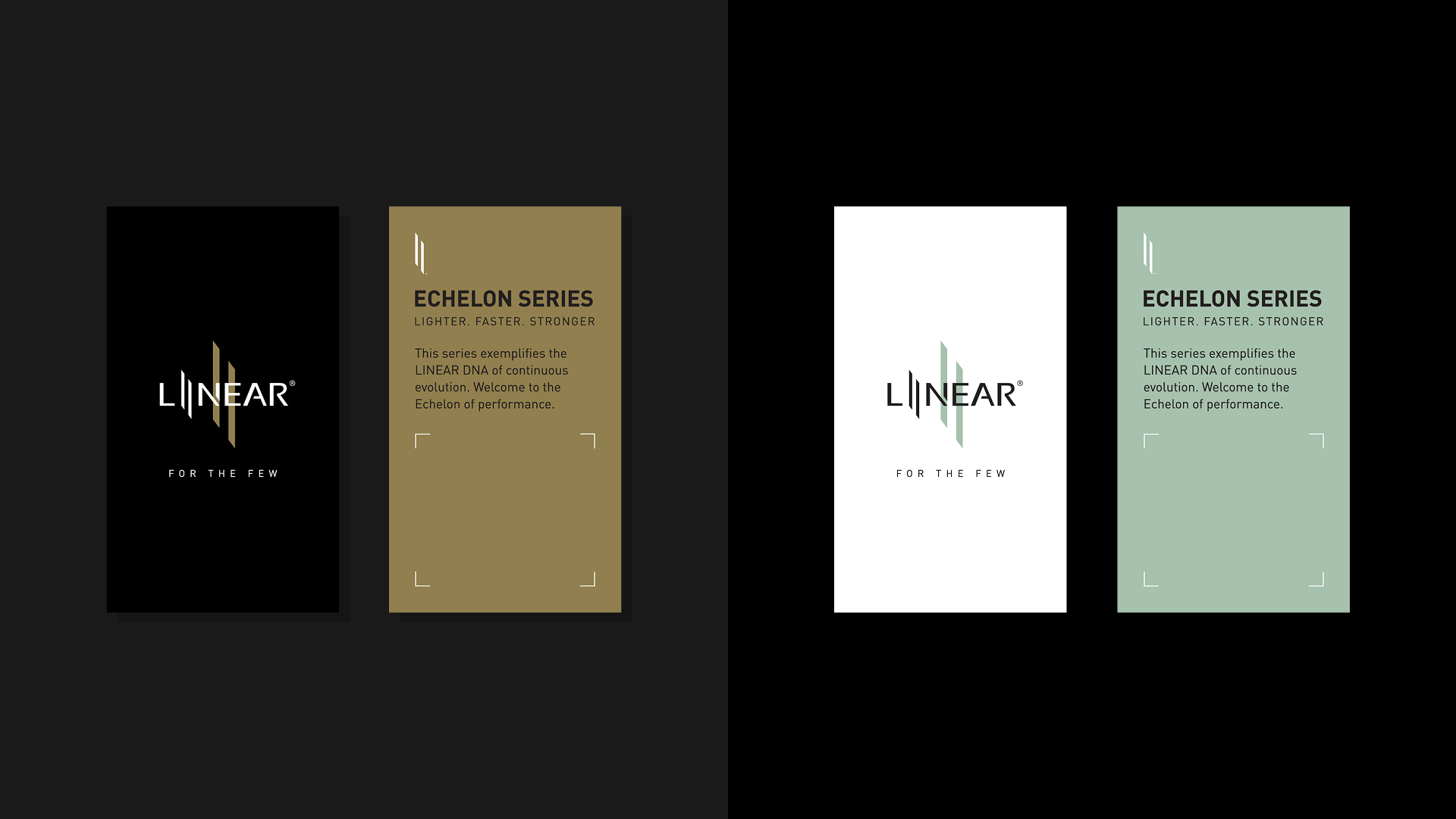
Primary Logo Variations
002
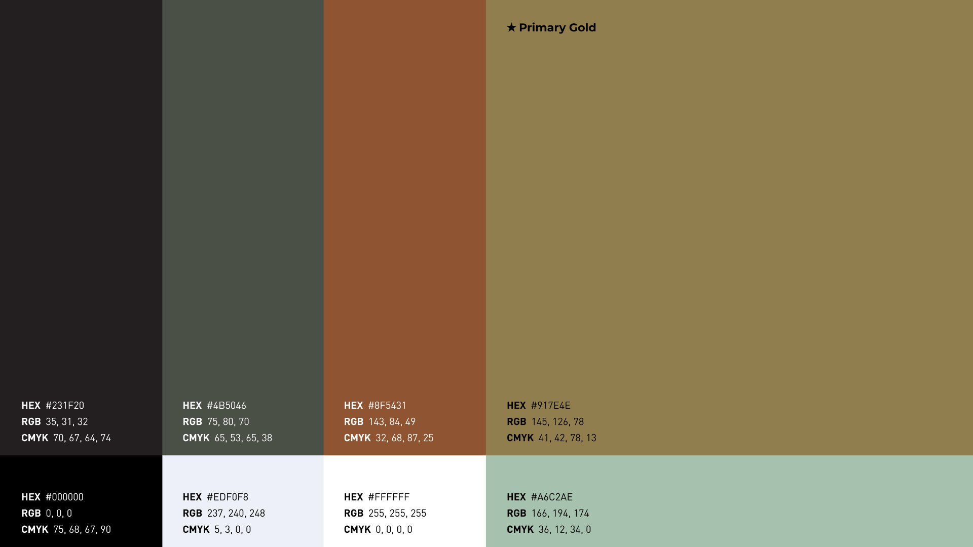
Color Palette
004
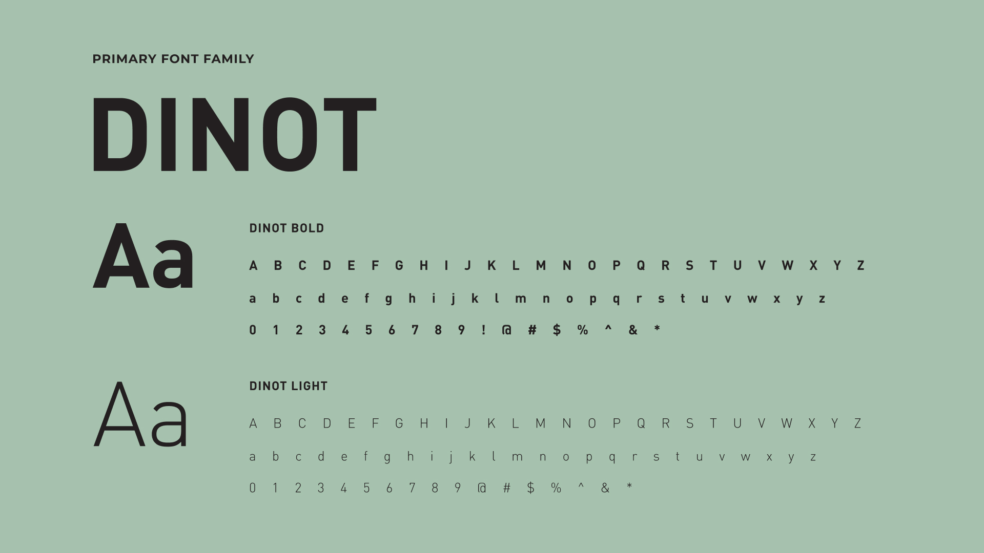
Typography
Prev
keyboard_arrow_left
Kitsap Bank
Next
Washington State Fair & Events Center
keyboard_arrow_right