


Sitka Insights
Task
-
Brand Identity & UI Design
Role
-
Art Direction & Design
Product
Agency

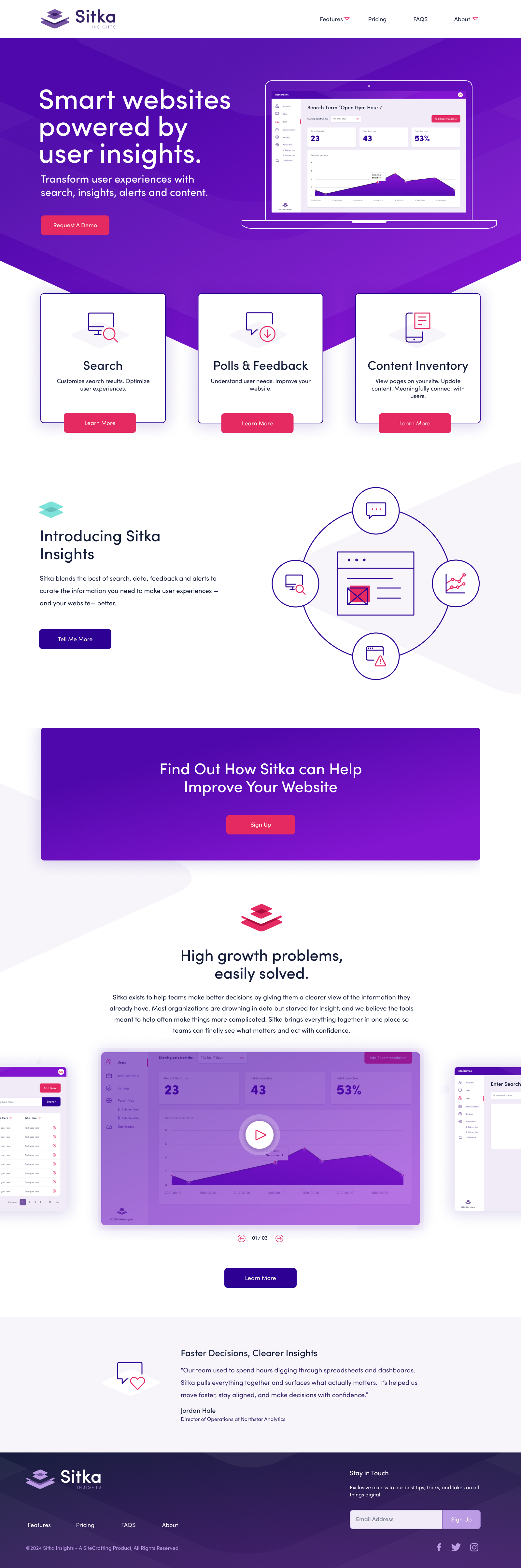
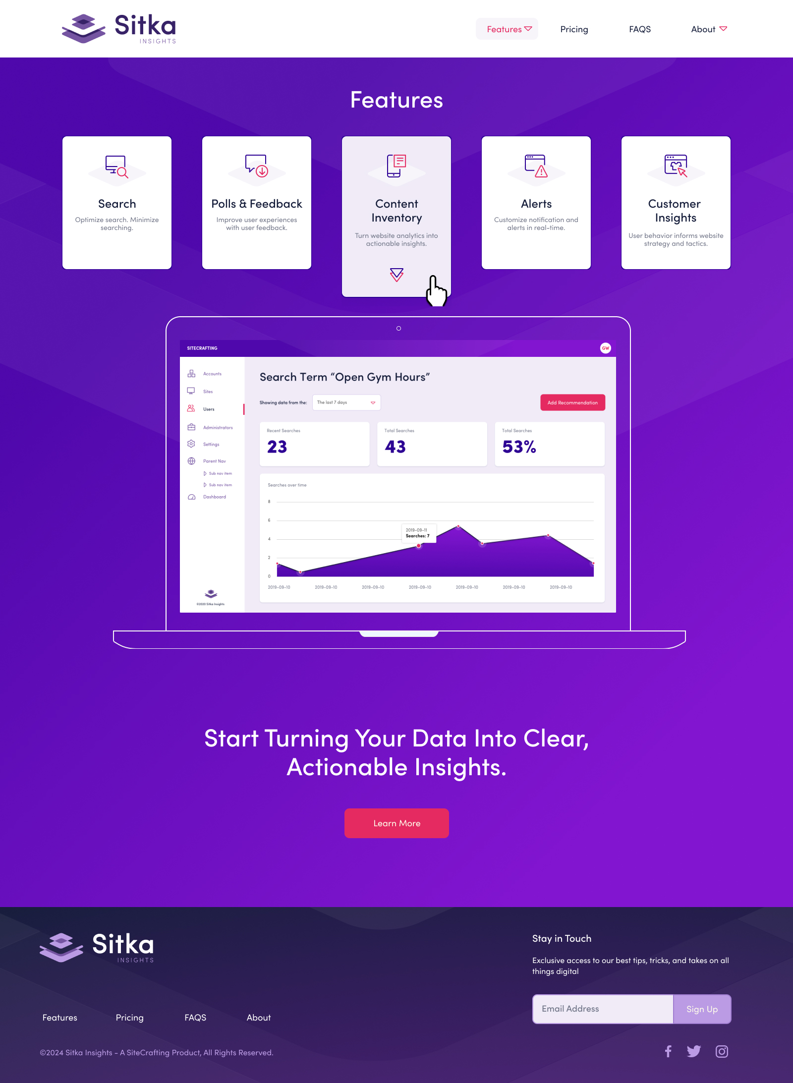
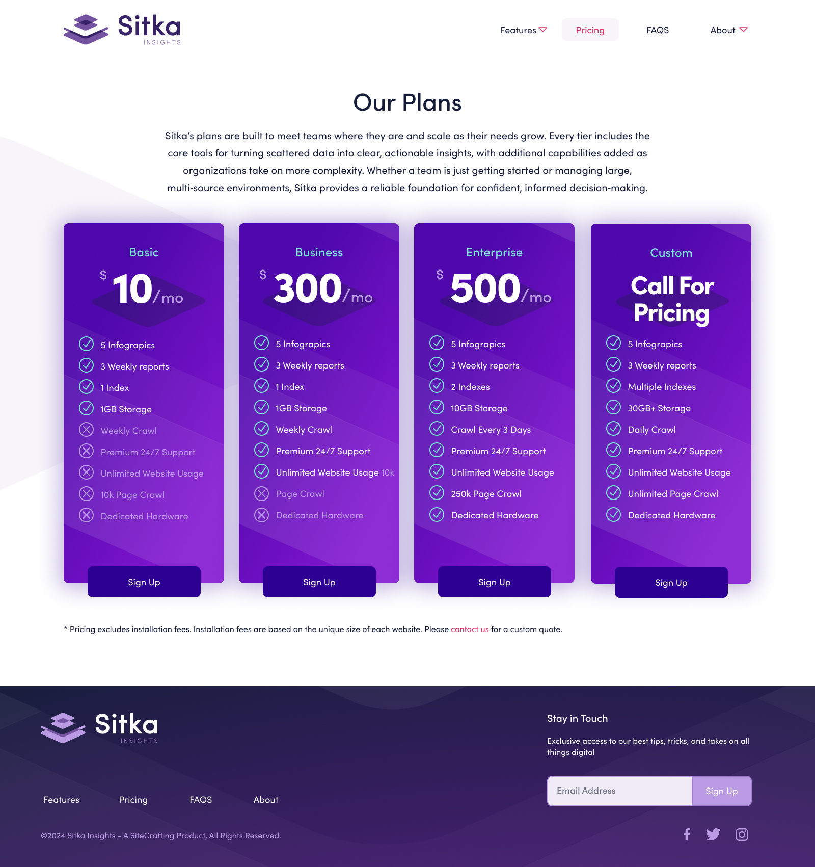
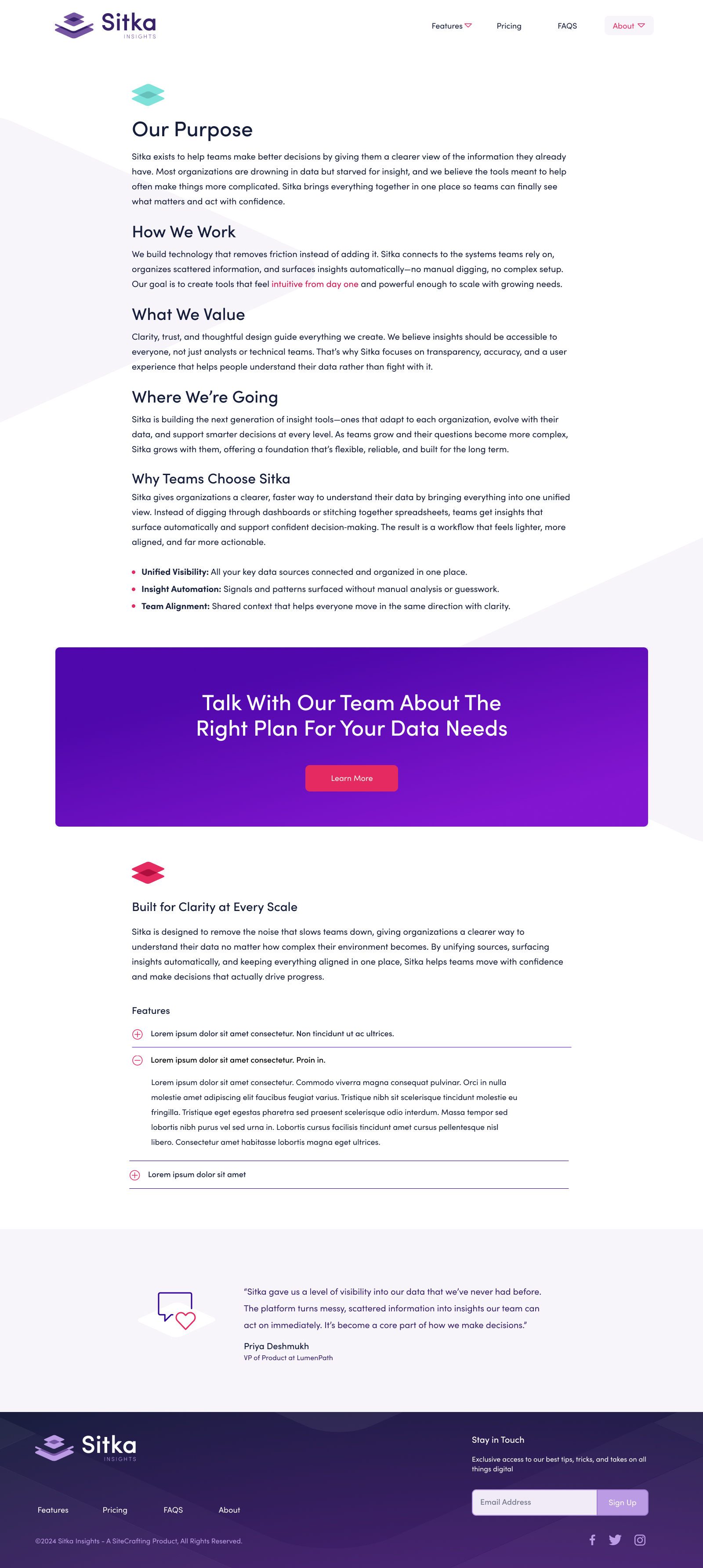
Design Challenge
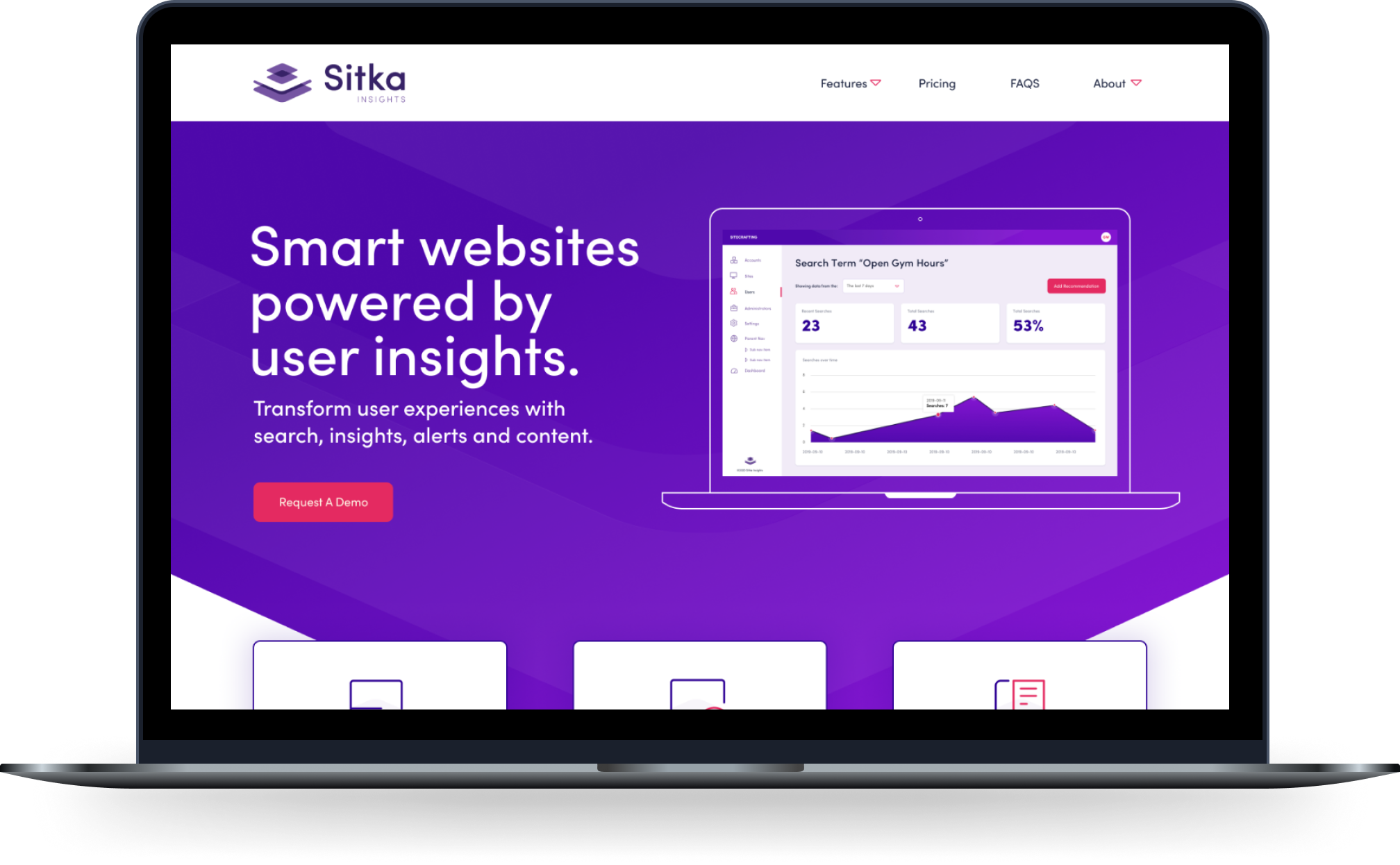
Sitka needed an identity that communicated clarity, intelligence, and approachability without feeling overly technical. The goal was to create a visual system that reflected how the product simplifies complexity and surfaces what matters. The brand foundations focused on building a clean, modern identity that could scale across product, marketing, and future features.
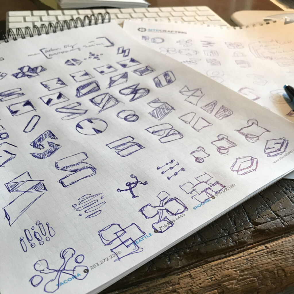
001
Primary Logo Variations
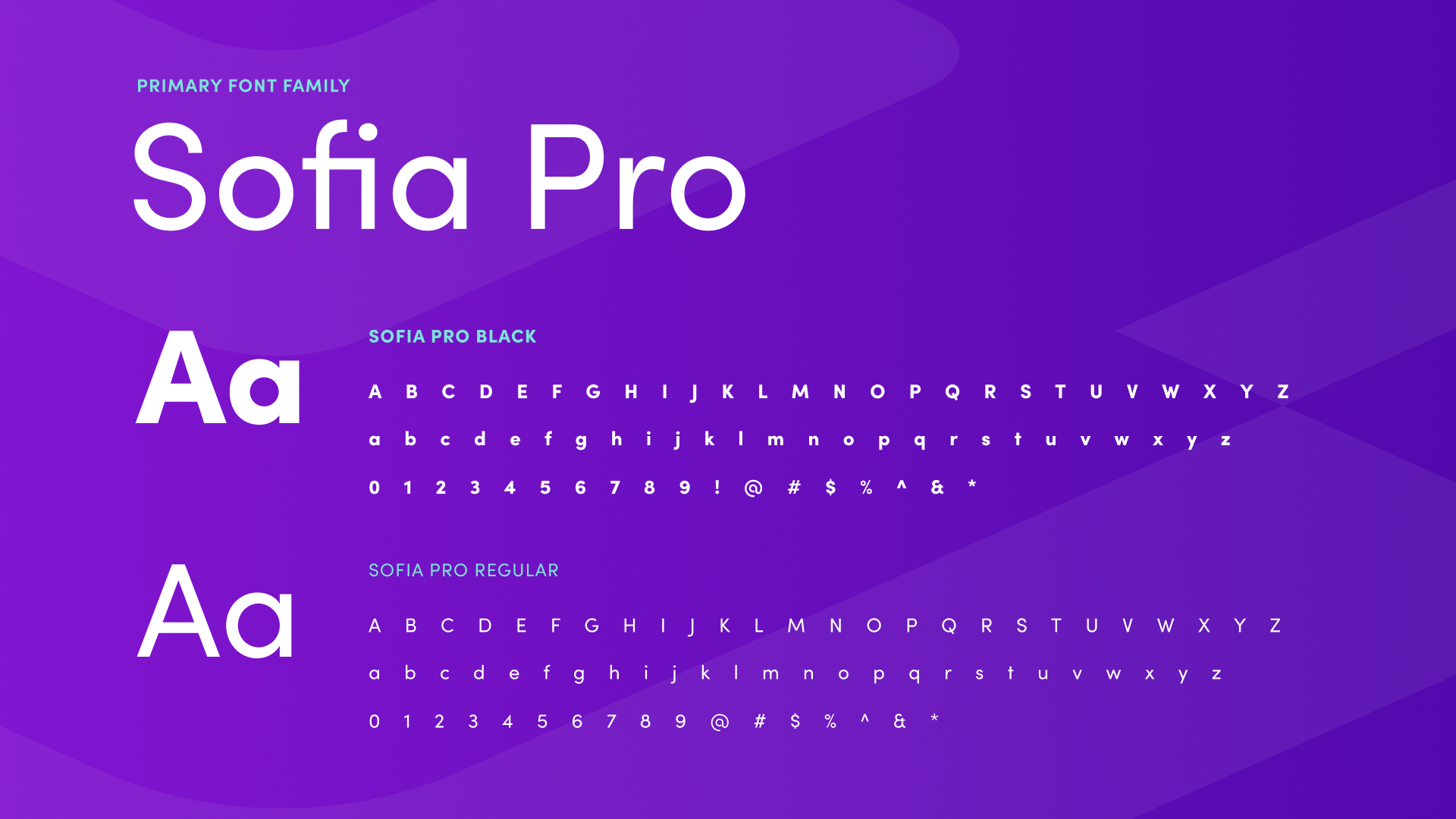
002
Typography
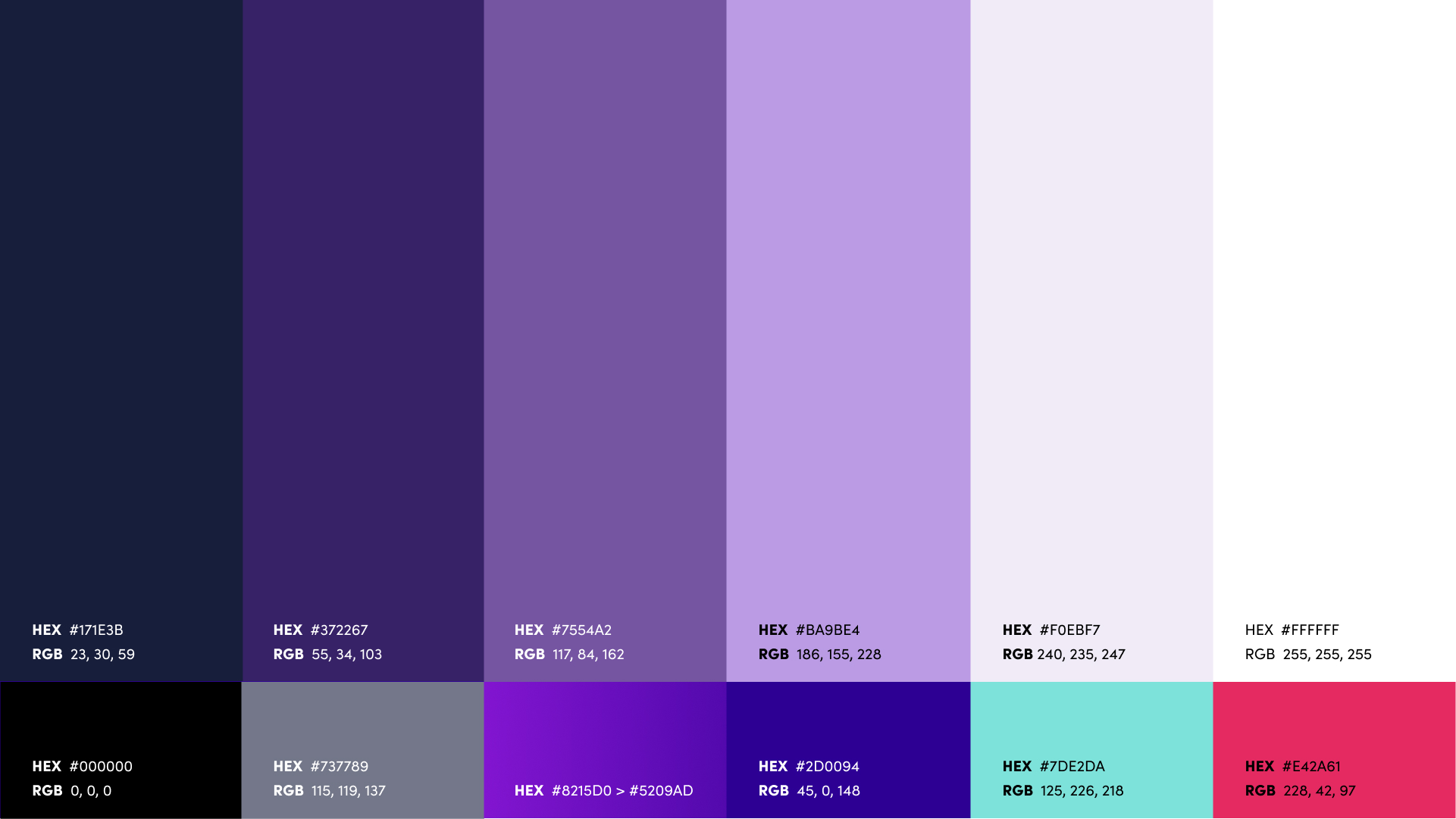
003
Color Palette
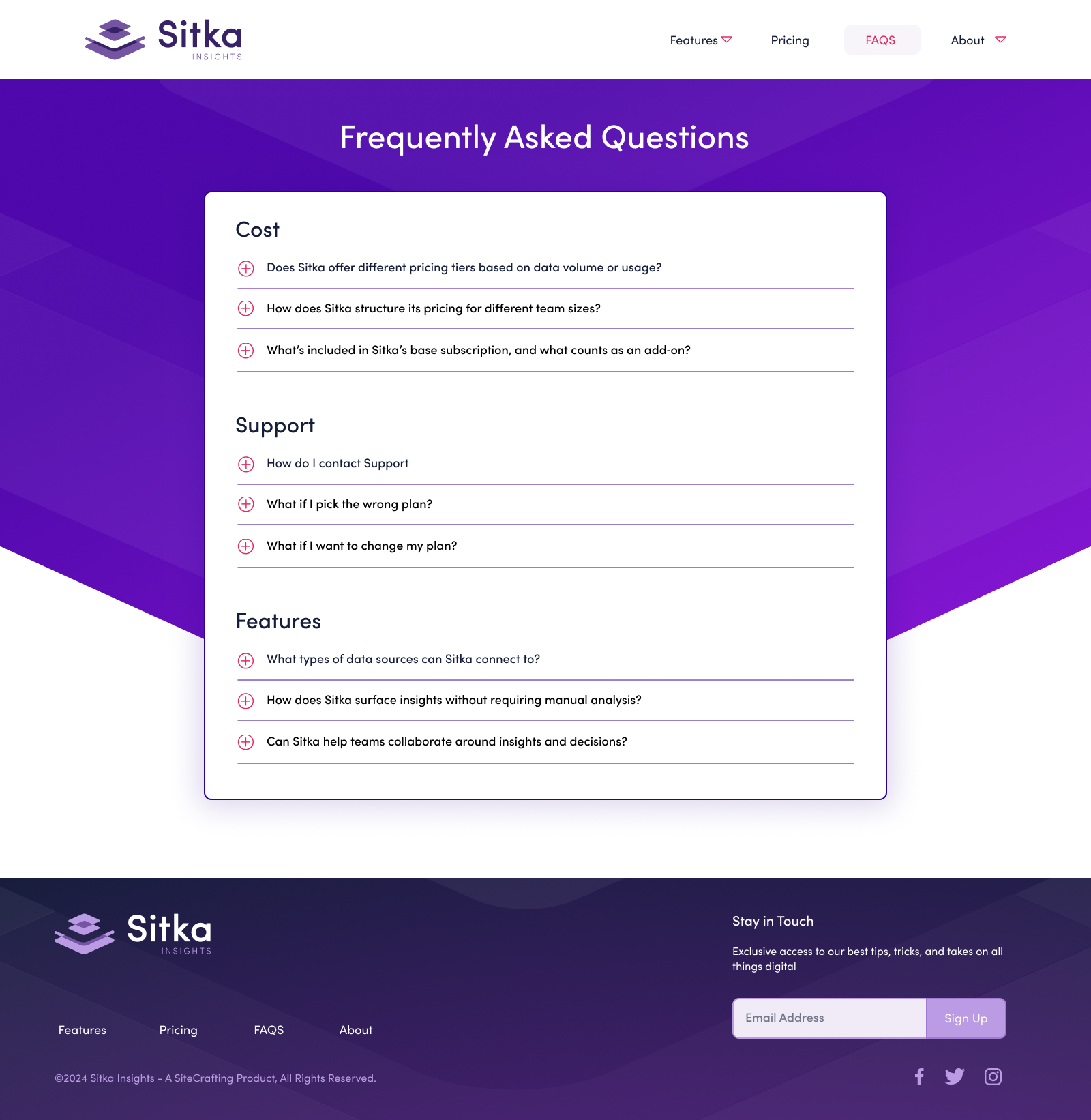
004
Marketing Website